
UX/UI creation takes at least three months. Sometimes 6-9 months. At the same time, it is very rare to finish a project with the same designer with whom it was started. Along the way, people burn out and can no longer do their job effectively.
Talk to design people at big banks, many of them have a huge turnover. Even top employees often change
But it happens that there are still outstanding people who can withstand all six months and even more. With all their talent and creativity, these people are very tolerant of boring and routine tasks. Even those who get some pleasure from such tasks.
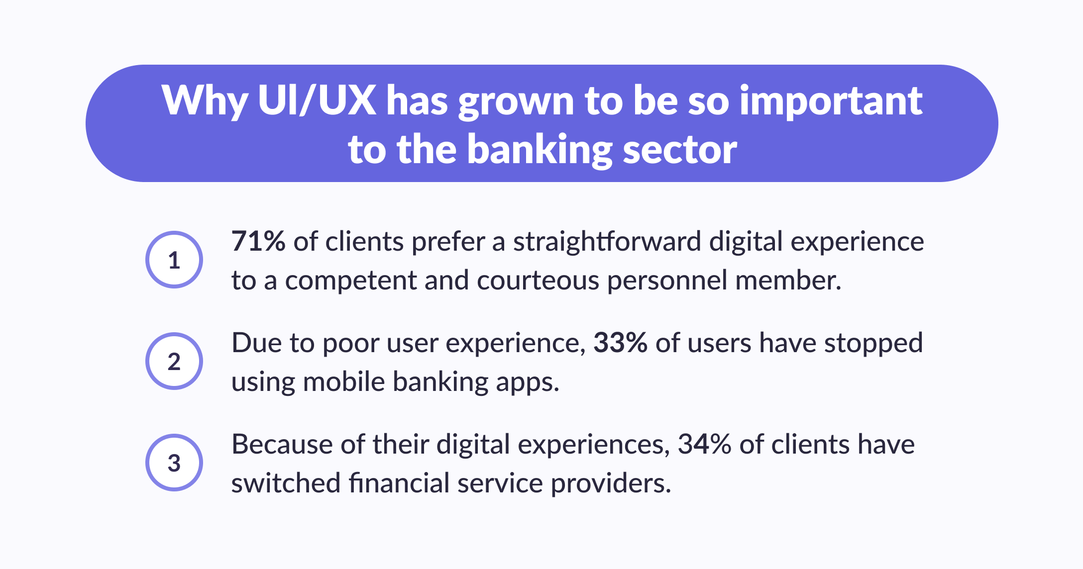
In this article, we will tell you what the UI UX of banking projects consists of and why it is such a boring task.
What is a complex UI UX project?
One can argue that, in general, it is possible to call a complex UI/UX project. But in general, almost always the assessment can be reduced to the number of screens designed.
For some kind of landing page, 3-5 screens are enough. For an online store, 10–20 screens. Banking apps for legal entities start from 100 screens. Moreover, 100 screens are for the designer to warm up their fingers. In the process, they are remade many more times, and at the end, the customer receives 150-200 screens (not counting night themes and mobile versions).
If this is a large bank that changes its design, then in 2–3 years, when the UI UX design is distributed among different teams and departments of the bank, it will already have 1000+ screens.
Team for the design of a complex digital banking project
Design director. They are responsible for the entire project as a whole and are engaged in planning, initial formulation, and quality control of work.
Project Manager. They are responsible for the interaction between team members and interaction with the customer, monitor compliance with agreements, and help to achieve them by any means.
UX design researcher. They identify the needs and pains of customers, outline the customer profile, and use cases for the application, conduct UX design tests and make comments on the design.
Assistant UX Researcher. They help the UX researcher, keep records (including videos), etc.
Front-end developer. They make a clickable innovative online banking app prototype for UX testing.
Business analyst. They help to understand the requirements of the customer and check the design for compliance with these requirements.
Accountant consultant. They are the main target group of our banking app; they share with us insights about their work.
Senior designer. Designs the main, most important, and critical scenarios.
Senior Designer Assistant. Designs secondary screens, states of screens, and other minor things.
Data designer. Ensures that layouts contain correct and consistent data.
Graphic Designer. Creates presentations based on the results of UX tests and on the results of all work.
Illustrator. Draws icons and other illustrations needed for the application.
Editor. Edits posts based on the results of UX design tests.
Features for bank app design
Many of these popular mobile banking app design patterns come from extensive research. But their main goal is not to tie you down but to accelerate the achievement of the norm and open up new opportunities for creative pursuits and unlimited customer satisfaction. The rules and advice in this section are more of a general recommendation than a strict classification.
1. Good onboarding is a guide to important goals
Users don't learn the ins and outs of your promotional materials (website, App Store, or Google Play). If you want to know for sure that you have a client who is interested in achieving goals, open up a map of goals that he can achieve using the application, offer them to choose a learning path, and support them with apps along the way.
2. The application is like an errand assistant, so valuable features must be constantly added
You've probably come across super-apps—or super apps—those are apps with a rich set of features (from sending money to complex analytics). Such an application keeps the user within one ecosystem of the services of a particular company. You can understand this feature by discovering these apps.
Usually, when creating a mobile banking app UX UI design, you need to add:
Dashboard Layout: A central hub displaying an overview of account balance, recent transactions, and key financial metrics through a clean, organized interface.
Navigation Bar: A bottom or side navigation bar providing quick access to major sections of the app, such as Accounts, Credit card statement, Money transfers, Payments, and Settings.
Interactive Buttons: Clearly labeled buttons for key actions like "Transfer Funds," "Pay Bills," "View Statement," and "Apply for Loan," designed for easy access and usability.
Pie Charts and Bar Graphs: Visual representations of personal finance management tools like spending categories, budget allocations, and investment performance to help users easily understand their financial data.
Search Functionality: A search bar allowing users to quickly find transactions, bills, or account details within the app.
Alerts and Notifications: Visual indicators or banners for important updates, such as low balances, upcoming bills, or security alerts.
Sliding Menus: Swipe-able menus or panels for accessing additional features or settings without leaving the current screen.
Form Fields: User-friendly input fields for entering details like payment amounts, account numbers, and personal information, often with built-in validation.
Transaction Details Pop-ups: Expandable or pop-up views providing more information about individual transactions, such as merchant details or payment status.
Customizable Widgets: Widgets that users can place on their dashboard to display specific information, like recent transactions, upcoming bills, or savings goals.
Graphical Timelines: Visual timelines for tracking financial events, such as payment due dates or loan repayment schedules.
Interactive Maps: Maps for locating nearby ATMs or bank branches, with interactive features for filtering and finding the most convenient locations.
Profile and Settings Panels: Accessibility features for managing personal information, security settings like two-factor authentication, and app preferences.
Onboarding Tour: A guided tour or tutorial screens that introduce new users to the app’s features and navigation.
Dark Mode and Light Mode: Toggle options for switching between dark and light themes to enhance user comfort and readability based on personal preference or ambient lighting.
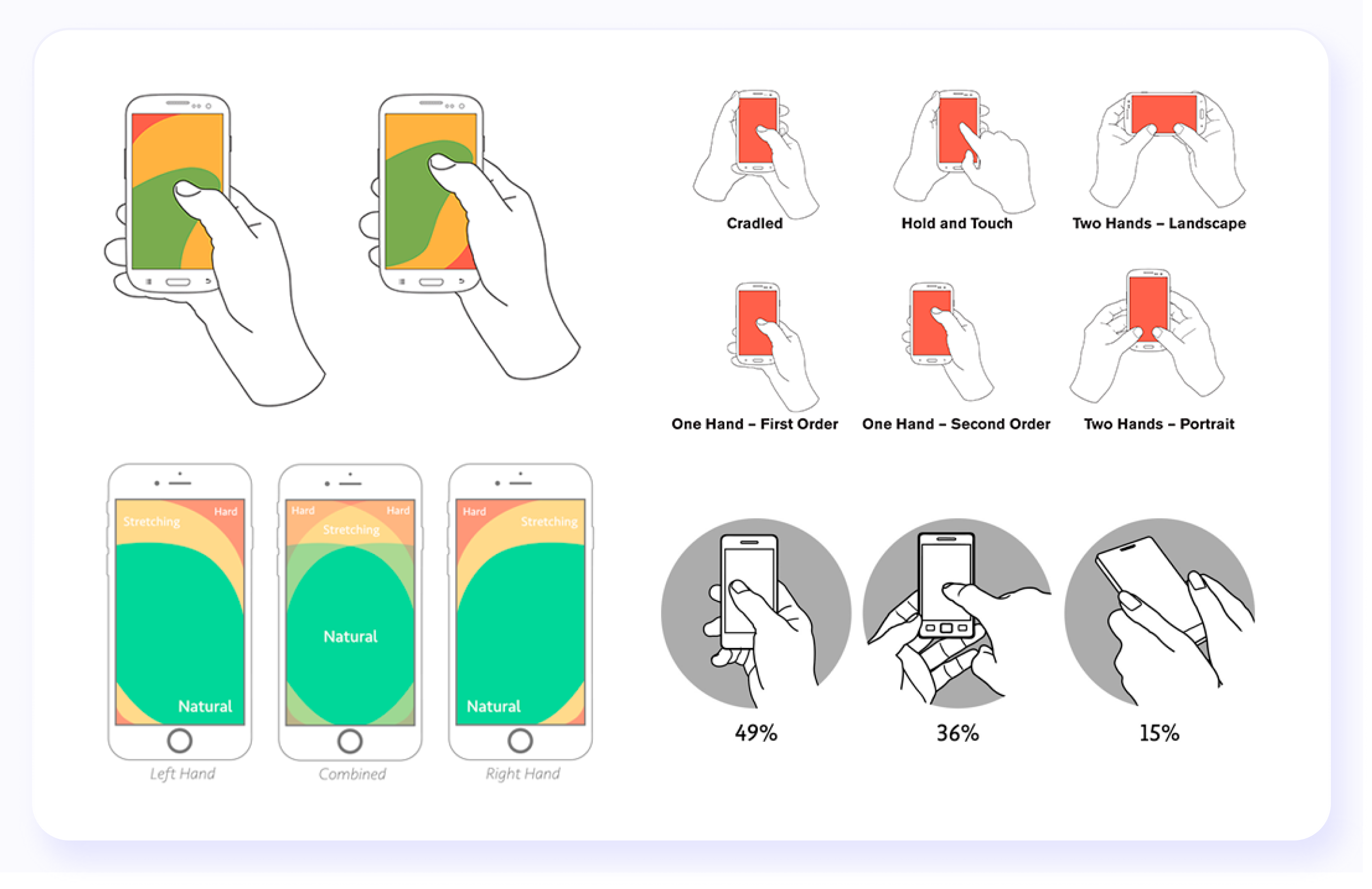
3. Common gestures are the key to an intuitive app
Standard digital banking apps set the culture. The more you study customers' habits, the more nuanced gestures you will take into account in your user interface. Scrolling, swiping, and photo zooming are classic. Take a closer look at the gestures and take into service what is already familiar to banking app users.4. Navigation and search are like a compass and map, and they are accelerators for achieving goals
Your task is to make a smart navigator out of the mobile bank application, and then each user, regardless of the complexity of the scenario, will be able to teleport to the target using clear steps through signboards and a quick access menu. Balance is important in intuitive navigation; otherwise, it can become too intrusive.
5. Place controls closer to your fingertips
Gather context on how customers manage and use your financial app and in what situations. This way, you can make sure that all key controls are within reach. For example, if you hold the phone in your right hand, then the key functions should be located within reach of the thumb. Explore maps of touch areas for different screens.
6. Your application is expected to be as fast as standard phone applications: YouTube, Browser, and Mail
Optimize the mobile banking app or find the points where the user has to wait for a response from the interface. Your application is expected to be as fast as the applications that are in everyday use by many users (such as YouTube, Browsers, and Emails). The users don’t want to wait for a response from the interface for more than 5 seconds. Think about how to beat them; a small animation of the search or preloader is better than a pause of a couple of seconds with no reaction to user actions. Animation can help smooth out the waiting time.
7. Remember preferences and recent financial activity
The user can be pulled out of the context of work in the application by a random call, a message in a chat, or a dead battery. Carefully remind him what he viewed recently, or offer to start over.
8. Deliver seamless user experience design – a team game between laptop, tablet, and phone
All devices in the world of users are a single ecosystem. Offer to install the application on all devices and explain how it will speed up the work.
Stages of creating a design for a large project
In general, the work consists of four stages: Creating the Technical Task, Design, Sending results to the Customer, and Maintenance.

More on the topic
UX Testing Methods: Best Ways to Test Users
Check out the best UX testing methods to ensure your product delivers an exceptional user experience
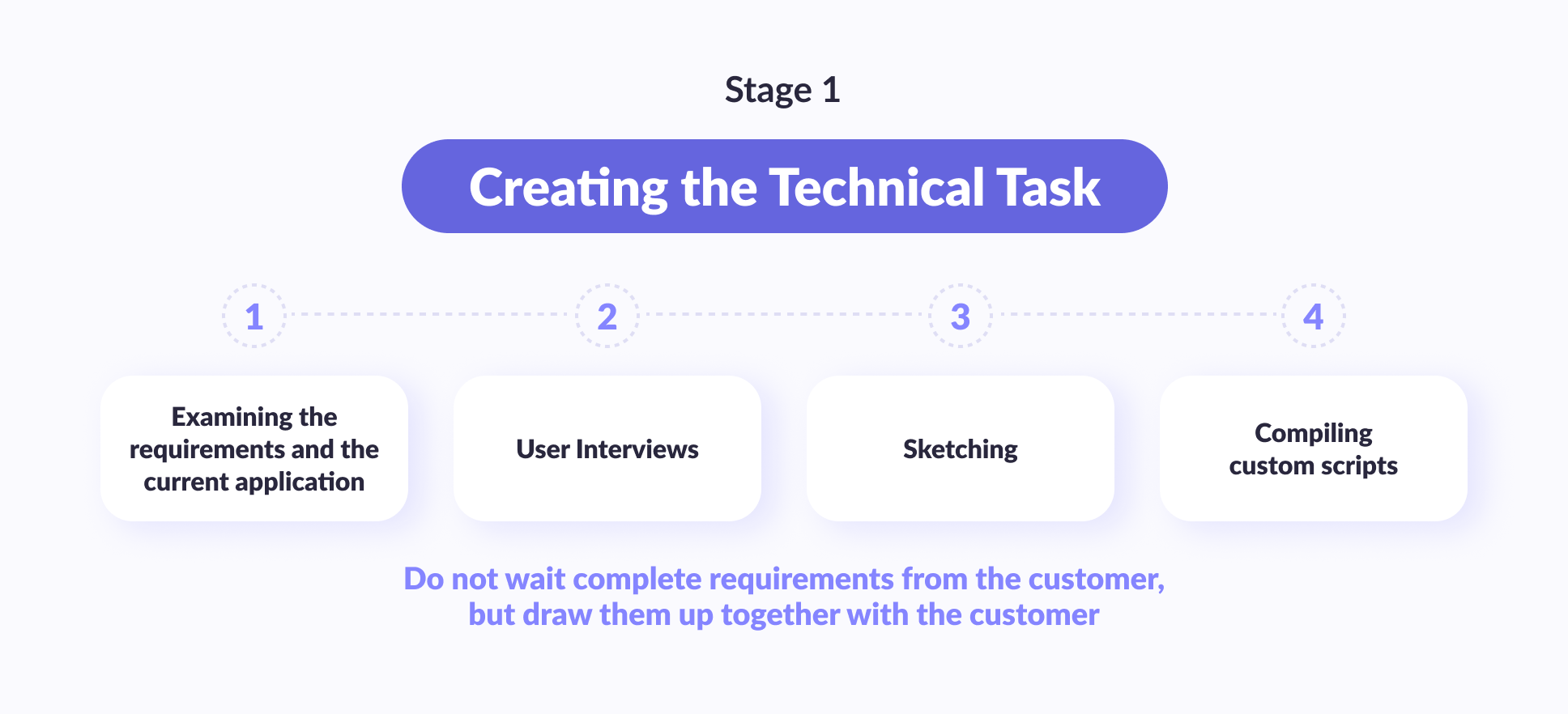
Read moreStage 1. Creating the technical task
The most important thing to understand at this stage is that the responsibility for a correctly set task should lie with the performer. For the customer, this may be the first design project in his life. They may not even know what to do. In such projects, the contractor, in any case, has much more competencies and expertise in design than the customer. Therefore, the performer must create for himself the final task that they will do.
From the customer, of course, you need to get some kind of initial statement. But you should not expect at all that this is its final and finished version. The final version should be provided by the design team. It turns out that the first stage of work is to understand what the customer wants.
The problem statement consists of 4 phases:
- Examining the requirements and the current application (if any)
- User Interviews
- Sketching
- Compiling custom scripts
There are two main people on the project who study the requirements: the design director and the project manager. If we need additional expertise, a business analyst and an accounting consultant are involved. The task is to read all the documents from the customer, communicate with him, and understand, at least in general terms, how the customer sees the project. A UX researcher is brought in to interview users. They need to find out what users require from the given application and what problems they might have with it.
Immediately, the design team identifies the main scenarios for using the application and user groups and composes user portraits.
Next, the design director designs wireframes. It is the design director, not the designer. And here, we find out how the customer sees the project in reality. Usually, at the stage of wireframing, it turns out to close most of the edits. You can't put a lot of effort into wireframing. They are made solely so that you sit down with the customer and can quickly move them. They will probably need to be changed beyond recognition several times.
Finally, the design director and the UX researcher create user scenarios with the wireframes, which helps to create a wider design concept.
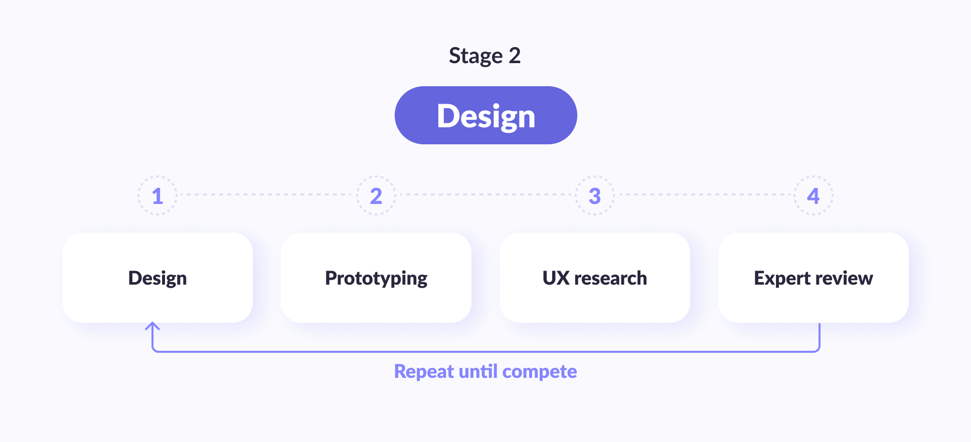
Stage 2. Design
Now the main work begins. Consists of 4 phases:
Research
Wireframing
Prototyping
- Banking App’s UI design
The design is done by the senior designer. More precisely, they start, draw the main screens, and then the second designer picks up the work so that the first one is not overloaded. At the same time, the information architecture designer makes sure that all TIN, KPP, and ITD are similar to the real ones so that there is no sedition in the texts and that the data from screen to screen is correct and does not raise questions.
This is a feature of banking applications. Most of the comments from the customer are not about FinTech app design, as such, but about data. Data design is done so as not to ask for unnecessary edits. Well, in testing, this also helps not to mislead the user.
By the way
Discover our comprehensive range of digital product design services, tailored to elevate your products and user experiences
A UX researcher makes the prototype. It is practically possible to do without a developer and make a clickable prototype in Figma or InVision. But HTML works much better. Users perceive HTML as a real banking app and behave in a markedly different way compared to when they simply see clickable images.
UX research is carried out, respectively, by a UX researcher. An assistant helps them with this. At this stage, usability tests give a good return.
The expert review should be obtained from at least four sources:
- Banking app UX expert talks about whether the application meets user expectations
- Business Analyst — Does the business meet the requirements
- Developer — does it meet the technical requirements
- The customer — does it meet their expectations?
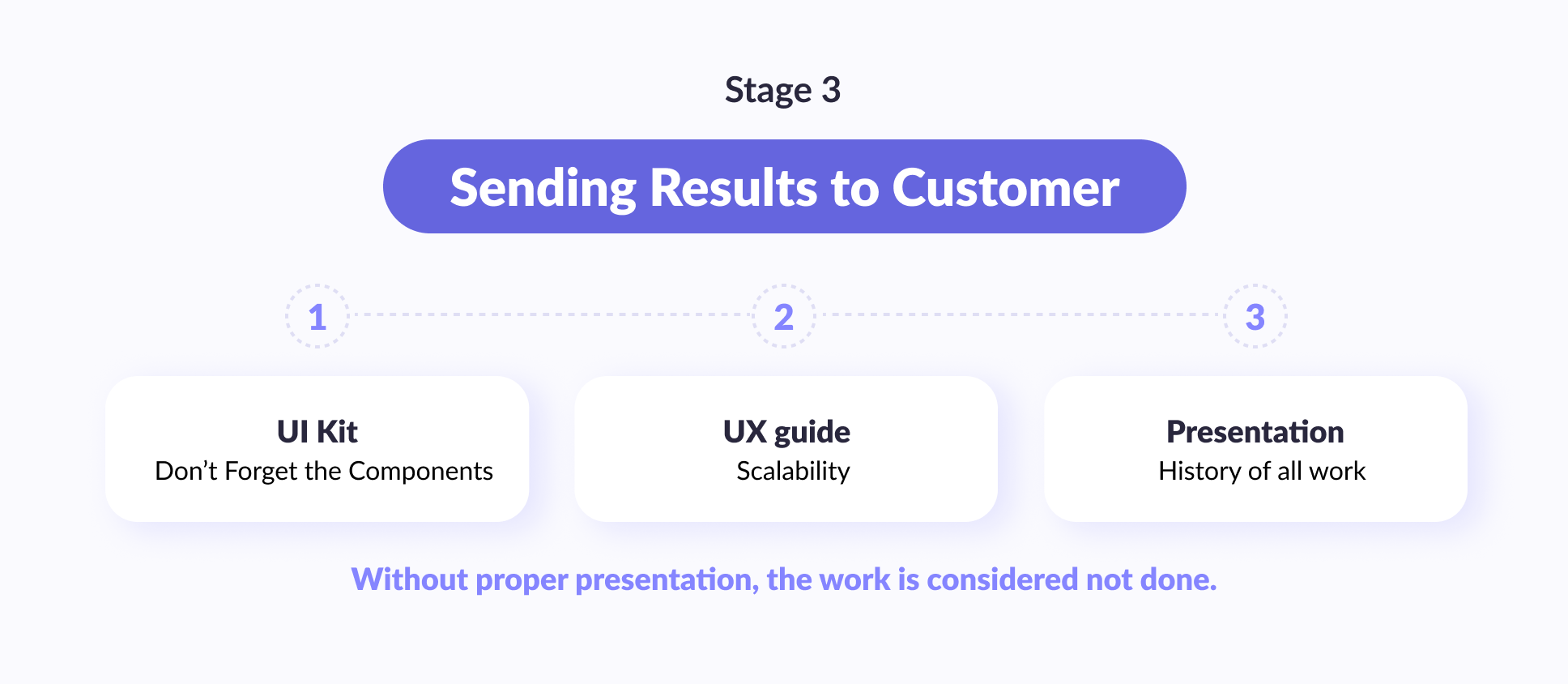
Stage 3. Sending results to the customer
Many UX designers (and even fairly large companies within the banking industry) are already beginning to forget about this. I sent the client just a link to the Figma (and then let him figure it out himself) — consider that he did nothing, work in the trash.
For the right effect, you need to do the following:
- User interface kit
- UX guide
- Presentation
The banking app UI design kit as a whole is still known. You need to move everything that is clickable and everything that has different possible states to separate slides. This is done by the senior designer. But few people are doing a UX guide (or something similar to it). It is needed in order to check the scalability of the project. Created by its design director.
And in conclusion, you need to present your work. In a separate presentation and at a separate meeting, describe which way you went and why you made exactly those decisions that you made.
Your digital banking app designs in the future will go to someone who has not seen the process of its creation. These people also need to understand why everything is the way it is and not otherwise. If they don't understand this, then they may simply refuse to take your design as a basis and instead make something of their own.
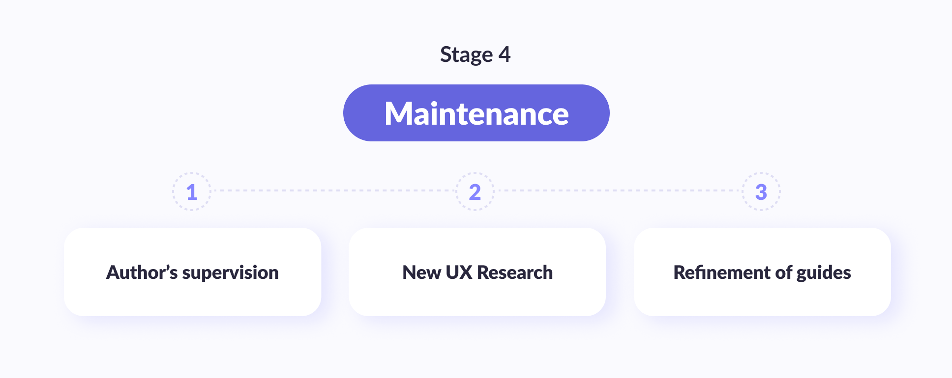
Stage 4. Maintenance
To really guarantee a quality result, you need the following:
Author's supervision
New UX Research
Refinement of guides
During the author's supervision, the designer looks at what the developers are doing and corrects them so that it is like in the layout. And you should warn the customer in advance that your guides most likely will not cover 100% of everything that is needed. And so in half a year — a year they will need to be corrected and clarified.
How to help developers to realize design correctly?
1. Use the tool that developers use
As a designer, the first step is to ask a simple question: ''How do you like working?” Many designers make the mistake of using tools or processes they are used to, or they have found success with a previous team. But things change quickly in software, and every command is unique. The future of digital banking software development solutions promises even greater innovation as financial institutions continue to invest in digital transformation to meet the evolving needs of their customers.
Some teams like to create a consensus document to track down bugs or use software to find them. Some may even just send an email or use a flexible tool.
The key to web & mobile banking app design success is not how good their techniques are, but how successful they are at interfacing their design so that the working design is as close to perfect as possible. A truly good designer can adapt to any tool needed for effective design interaction—even if learning a new tool takes a little longer. This pays off in paving the road by reducing friction with software development.
2. Participate in the full development cycle
UX designers can easily ruin their relationship with developers if they don't activate until the very end of the product development cycle. The development team working towards launch gets frustrated when an outsider swoops down with a few significant changes. (And if you don't turn it on sooner than right before launch, you're effectively an underdog.)
Developers require designers to participate in the full lifecycle of a product or feature, not just front-end development. Designers should be well aware (if not involved) of the heavy engineering challenges of creating basic data structures, storage, search, and interface frameworks.


Thank you for Subscription!
3. Be specific about what needs improvement
Many designers think they're done when they give a finished, “pixel-perfect” layout to a developer. Designers get nervous when a product or feature gets close to release, and the front end doesn't look up to specification. But instead of responding to the latest developer build, ''This doesn't match my layout; here's the layout in case you've lost it,'' — be specific!
Designers are trained to notice even the smallest details that most people will never notice. Developers don't intentionally leave out details — it's just not as high of a priority for them as core functionality or bug-free code. It is the designer's job to notice these errors and point them out as specifically as possible because the person you are working with has not been trained to look for these types of details.
4. Real conversations are good, but they can't be tracked
Many designers I know prefer to develop design details in person with a product manager or developer. This is wonderful and can help team cohesion, but the side effect of this is that there is no paper trail. Unless you're on a team of two (you and your developer), everything should be documented for the team's wide access and responsiveness.
5. Meet your developer
Never underestimate the power of socialization in team members. Get to know them and let them get to know you. You can improve trust and connection if someone feels like you care about them as a person – not just a set of skills you can rely on to get a design vision.
Conclusion
And in the end, here are a few tips on the very design of a mobile bank.
1. You need to hear your users. Pay attention to your customers' complaints, concerns, and needs; you'll find the quickest and easiest way to improve customer loyalty and customer engagement. It may be a little scary, but try to look out for the patriotic narcissism in the service, and you will be surprised at what users actually think about your service.
2. Don't be afraid to break the status quo. Revisit financial industry standards to find a window of opportunity, even if it's just about simplifying and improving the design of the user friendly interface.
3. Become user-centric. Switch your business strategy from a product-centric to a customer-centric position. Provide personal financial services to your customers in accordance with their real needs instead of imposing morally and technically obsolete services familiar to the digital banking business.
4. Update your product strategy. Well, or develop if it is not already there. Study the channels that your users prefer and make the service as convenient as possible in them.
5. Make your banking experience amazing. Delight users with the interface of your service, making it simple and advanced. In this age of hundreds of digital mobile banking apps and online services, users have become lazier and more demanding.
We wish you a successful design and development of mobile banking!