When it comes to mobile app development, many UX designers and software engineers overlook the importance of accessibility. Most applications are not tailored for students with special needs (with some form of limitation). While many development teams see accessibility as a ''nice to have'' feature, it plays a critical role in today's mobile world. Building an EdTech mobile app with accessibility in mind can dramatically improve user experience and increase revenue.
''We need to make every single thing accessible to every person with a disability.'' — Stevie Wonder
In this article:
The importance of accessibility
In 2023 approximately 16% of the world's population suffers from some kind of restriction or violation. Best apps for special education play an increasingly important role in the daily lives of students with special needs and special educators. You should think that about one in seven of your users may not have the same level of access as other users of the app.
A common misconception is that accessibility is an optional feature when developing mobile apps. The Android and iOS platforms offer accessibility tools to developers to help them implement interfaces that work for all users (including those with disabilities or impairments). Obviously, it's not just people with disabilities who benefit from good UI and UX: voice assistants like Siri and Alexa have become very common, and tactile feedback (like vibration) is part of Google's Material Design guidelines. Some may want to use, for example, a communication app while driving or doing laundry without touching a mobile device.
In addition to moral considerations, you can expand your user base by making it more inclusive. From a business perspective, it makes sense to try to reach 15% of additional users. Last but not least, governments are beginning to implement laws and regulations that require equal access for all users. More on this later.
Since accessibility for special needs students positively impacts applications, one might wonder why this is often overlooked. There are several reasons. Android and iOS have evolving ecosystems, meaning all platforms are creating new accessibility features. Many assistive technologies are available for developers, but they are still under development. Even when they can be used, it typically takes a lot of time and practice to implement accessibility features, and developers, let alone UX designers, often have no experience with them, making it difficult to design and test. Finally, unlike the Web Content Accessibility Guidelines (WCAG) for educational websites, there is no single document that defines accessibility standards for mobile applications.
Understanding of accessibility
I talked about the importance of accessibility, but what exactly does it mean? In simple terms, accessibility describes a way of developing educational products that are fully accessible to users with vision, hearing & other disabilities and students with special needs. These violations and restrictions can take many forms, so I will describe those that are most relevant to EdTech mobile applications.
Vision
Users with any kind of visual impairment experience the greatest difficulty using a mobile application that is not suitable for them. Color blindness, low vision, or even complete blindness are the three main disorders. In the context of accessibility, sound, usually in the form of a screen reader, is often used to compensate for the lack of visual information.

Hearing
Whether the user is deaf, has a mild hearing impairment, or has difficulty hearing in a certain range, there is always a way to realize a good user experience. Educational video and audio clips can be enhanced with additional text or titles.
Mobility
Special needs students may face challenges navigating the Edtech mobile app. Touch or other forms of gestures should be customizable so that the user is not tied to a specific gesture. In addition, the motion should never be a required event, as physical restrictions should not interfere with navigation. Both Android and iOS offer users the ability to customize shortcuts for frequently used phrases or words, as well as the time between screen taps. The size of buttons (or other touch triggers in special needs apps) is also configurable.
Literacy
An often overlooked aspect of accessibility is accessibility for people with learning disabilities, such as (functional) illiteracy and (functional) digital illiteracy. This is not just a problem in developing countries: the Dutch government estimates that 1 in 9 citizens between the ages of 18 and 65 have difficulty reading and writing skills. According to the World Population Review, about 1 in 5 U.S. adults (21%) has low literacy skills in 2023, translating to about 43.0 million adults.
Special learning apps can better serve these users by using simple, short sentences supported by clear, culturally recognizable iconography. Voice feedback is also an option.
Implementing accessibility solutions for any of the above constraints is insufficient to make the application accessible. Ideally, all aspects should be considered when designing and developing a mobile app, providing a good user experience for everyone.
''Accessibility allows us to harness the potential of everyone.'' — Debra Ruh
Who should implement accessibility and why?
There is no dedicated person to implement accessibility into your product. This requires the involvement of the entire team:
UX/UI designers — design interfaces following accessibility guidelines.
Programmers — write the correct markup/layout of pages, and make sure that all elements have the necessary tags and attributes.
Testers — conduct accessibility testing.
The main motivations for implementing accessibility are:
Empathy: We can minimize the barriers between users and content, thereby making their lives better. But, if you are not that sensitive and receptive, there are other quite compelling motivations.
Competitive advantage: Increase in the percentage of satisfied users.
As I mentioned earlier, up to 15% of users have permanent, temporary, or situational obstacles when interacting with the Internet. It doesn't matter what your company is focused on — websites, Edtech mobile or desktop applications, and services — when you implement accessibility, you achieve an increase in the percentage of users who can successfully interact with your resource.
Among other things, accessibility is one of the modern trends in the IT world, the use of which improves the image of your company.
Law: A prerequisite for developing products for large international projects. In most EU countries, and the UK, USA, Canada, Australia, Brazil, and India, accessibility standards are enshrined in legislation.
Benefits of the app for special needs
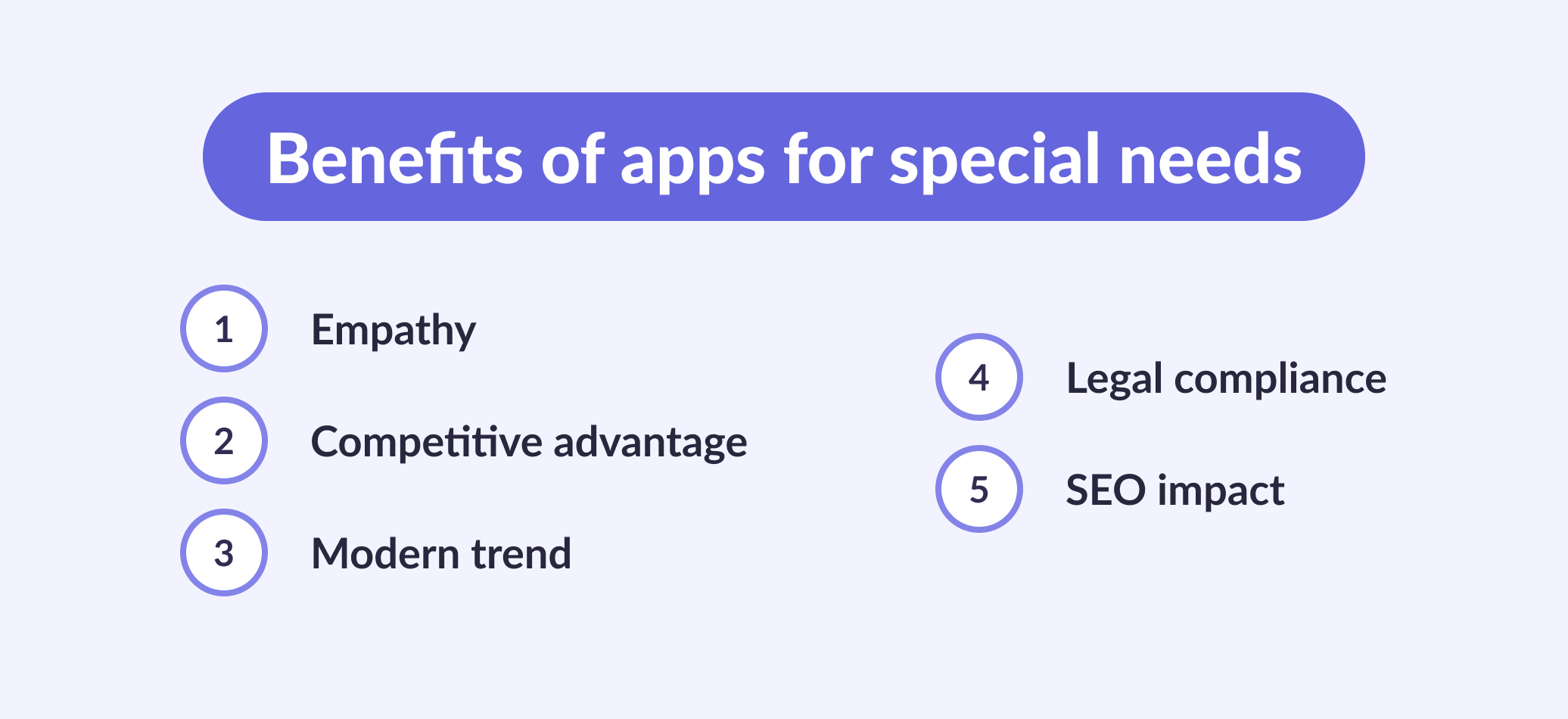
Motivations for embracing accessibility applications are multifaceted:
Empathy
Breaking barriers between users and content is at the core, aiming to enhance their experiences. But beyond sensitivity, there are other compelling reasons.
Competitive advantage
About 16% of users face obstacles online, be they permanent, temporary, or situational. Regardless of your company’s focus—be it websites, mobile, or desktop applications—implementing accessibility broadens the user base interacting with your resources.
Modern trend
Accessibility isn't just a trend; it's a modern necessity in the IT world. Its incorporation enhances the overall image of your company.
Legal compliance
It's a crucial factor, especially in large international projects. Accessibility standards are legally mandated in most EU countries, the UK, the USA, Canada, Australia, Brazil, and India.
SEO impact
Making content easily discoverable and navigable significantly improves website search engine rankings. Accessible applications, incorporating features like alt text for images and well-structured HTML, enhance visibility to search engine algorithms.
The inclusivity of accessible applications not only broadens audience reach but also aligns with search engine preferences for user-friendly, well-organized content. This alignment ultimately elevates the website's ranking in search results. The powerful synergy between accessibility and SEO empowers websites to be more discoverable, relevant, and impactful in their digital presence.
Inclusive Edtech applications best practices
Now that we are familiar with the various obstacles, it is time to look for possible solutions to improve accessibility in education software development.
One of the most important aspects of apps for children with special needs is consistency. Consistency is always a core UX principle, but it pays dividends for users with disabilities. For example, finding an illogical home button is much more difficult when you can't see the screen.
And it's not easy to have consistent experiences across different screens. You need the same experience with interfaces: be it sight, touch, or hearing, every user must be working with the same UX.
Navigation
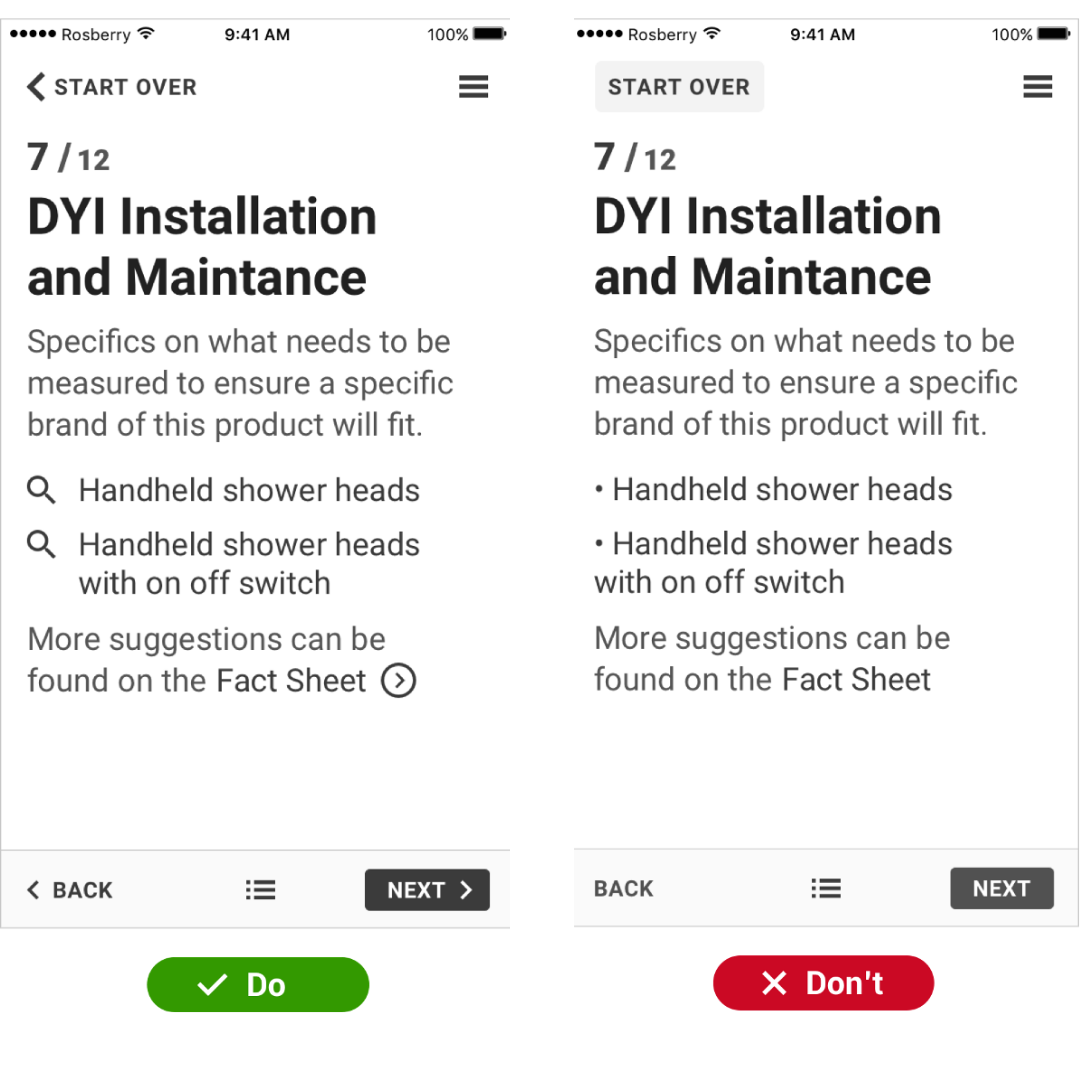
Buttons and URLs don't have to be directly related to your screen content. Instead, actions should be clearly labeled and separated from the text. Changing the text style (like underlining/bold) should also clarify these points.
While we mentioned consistency earlier, it needs to be emphasized further when discussing navigation. Users with cognitive disabilities will benefit from a consistent and clear layout. Even completely blind users will immediately understand your layout if the mobile app adheres to either Google's Material Design Guidelines or Apple's Human Interface Guidelines.
The last crucial rule is to warn users when a navigation action exits the application. Users should never accidentally close your application.
UI
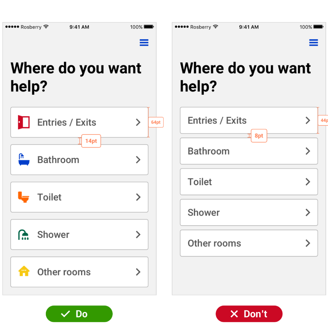
It's important to remember that your mobile app can be viewed in different resolutions. Users can enlarge the picture by up to 200%. Your application should be tested at different resolutions to give a good user experience.
Working with flowers is also significant. There should be a clear contrast between the foreground and background. Placing light text on a white background or dark text on a black background will make the content difficult to read. The result may be unreadable for most users, and it will not be readable for people with visual impairments.
Content
Adapting curriculum materials and using assistive technologies are common practices in special education. In terms of actual content and contrasting text, the font style of the text is also essential. While a fancy font might be appealing to some, it might not be readable to others. Be careful when using fonts that are italicized or difficult to read. If in doubt, please use the suggested (or default) font as referenced in the previously mentioned guides.
Images can also distract attention from user interaction when the app is not tailored for accessibility. It becomes even worse when images are not used for decoration but are meaningful. You must provide text descriptions for these images. These descriptions should describe in detail what is happening in the picture. They can also explain how a particular image relates to the text. However, there is no need to repeat what you already wrote before. This way, visually impaired users can get the same user experience as everyone else, as assistive special learning apps on their devices will be able to convert text to sound.
Duplicate phrases can confuse the user or look like a mistake. In short, decorative images (or images that do not contain any additional information) should be ignored by accessible digital tools.
Video and audio content must also be adapted for accessibility. All media player controls must be accessible to anyone. For example, hearing-impaired users should be able to change the volume of the media being played. For those who do not have enough volume, captions are necessary when the message is transmitted via video or audio.
Testing
To ensure quality, all professional software products must be thoroughly tested before deployment. The tester can check if all accessibility features are implemented correctly. However, if you want people with disabilities to have a good user experience, it is advisable to put together a group of beta testers with disabilities. Colleges, universities, or local organizations can help bring this group of testers together.
Top helpful apps for special needs
Limitations of mobility, vision, and hearing must be taken into account when developing web and mobile platforms for education. Many services and applications have already been developed that make life easier, which were impossible even yesterday.
Let’s take a closer look at the best special education apps and interactive games that can help you create cool EdTech applications. These special education services are designed to enhance skill development, such as augmentative and alternative communication, fine motor skills, and cognitive abilities.
1. Be my eyes

A service that, without exaggeration, can be called a genius. This application is for phones. The principle of operation is that a visually impaired or blind user can direct the camera to the place where he wants to see something if he does not see something around. A sighted volunteer will tell him online what is where. The video on the site shows how a volunteer helps a blind person take an object from the table. Unfortunately, so far, the service works only in English.
2. Tecla device

The creators of this device asked themselves: “How can people with disabilities use familiar devices: a phone, a tablet?” Tecla allows people with limited upper-body mobility to access their smartphone or tablet using assistive devices. Let's say a person can only press one button; the device helps students translate the pressing of one button into specific movements on the smartphone screen.
3. Finger Reader
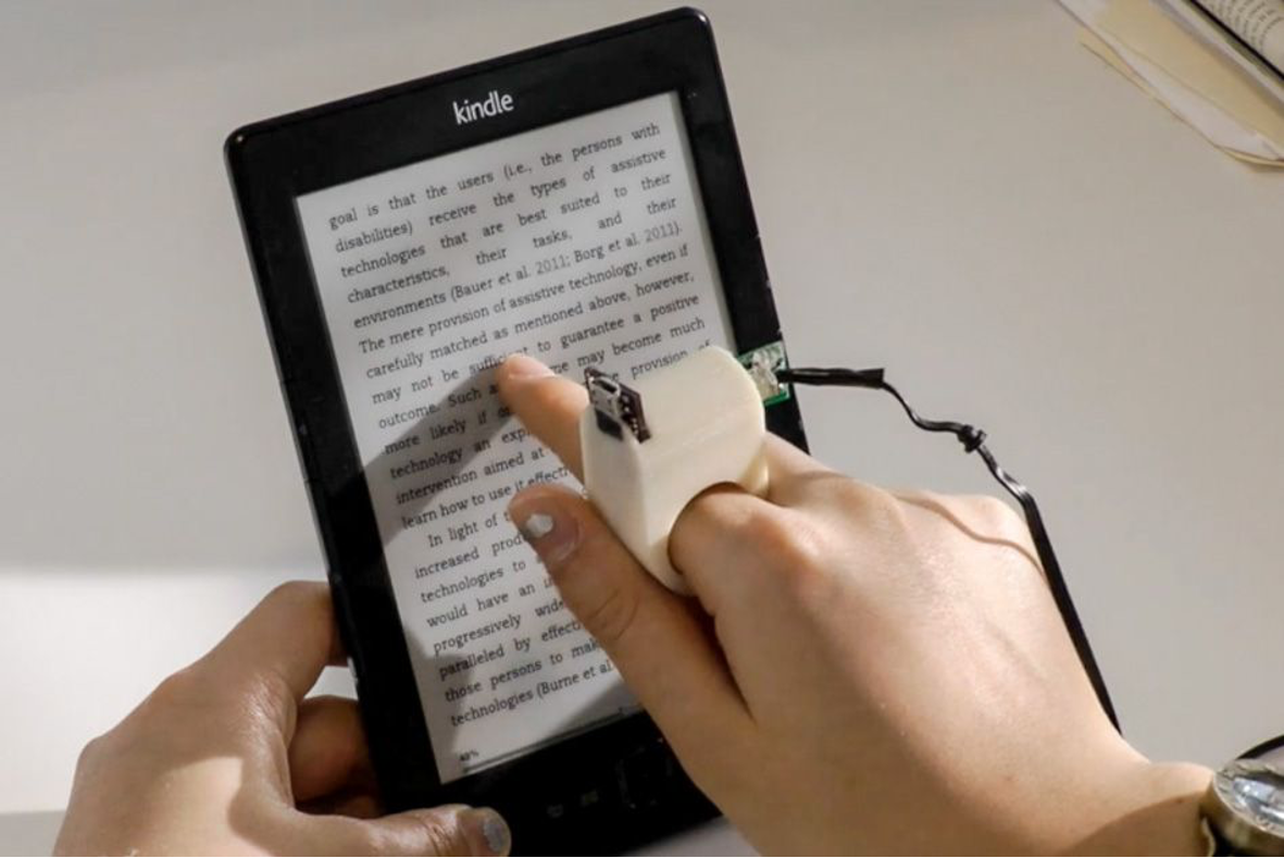
The Finger Reader allows blind and visually impaired people to read ordinary books. Putting on a finger a ring-like device equipped with a miniature video camera, the person runs his finger over the text. The device reads the text and speaks it out loud.
4. Otsimo
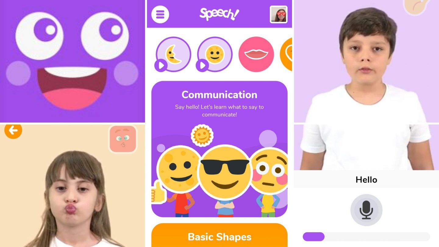
Otsimo is one of the apps for special education teachers that stands as an educational app catering to individuals with special needs, specifically tailored for students with autism & cerebral palsy. Its primary aim is to bolster fine motor skills and cognitive skills through engaging play-based activities. This application is meticulously crafted to impart foundational language knowledge and language development skills, reading, basic math skills, and logic.
Otsimo operates on the bedrock of applied behavior analysis (ABA), a therapy widely employed in special education and therapy that helps children with limited speech. This method is instrumental in aiding individuals coping with learning disabilities and attention deficits. Leveraging the most impactful techniques within the realm of ABA, Otsimo ensures a comprehensive and effective learning experience.
5. Choiceworks
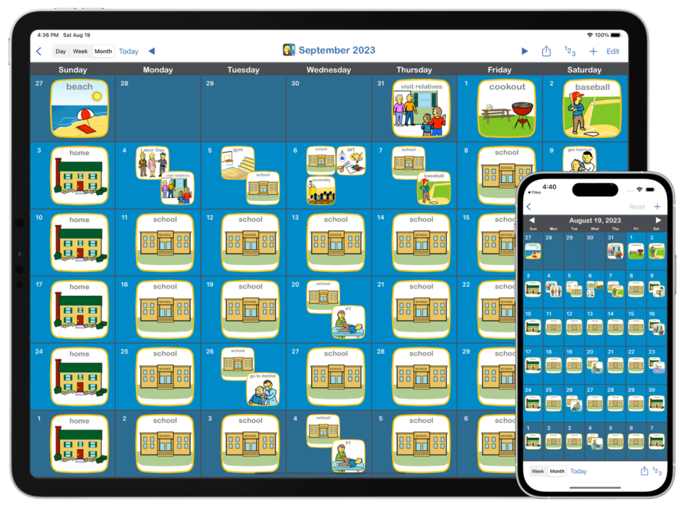
Choiceworks is an iOS app designed to craft visual and adaptable schedules for children. With this app, your child can easily grasp what's coming up next in their day and understand their current choices within a structured schedule. Effectively utilized, Choiceworks alleviates the stress often linked with transitions and offers clarity, eradicating uncertainties surrounding schedules.
6. Speech Blurbs
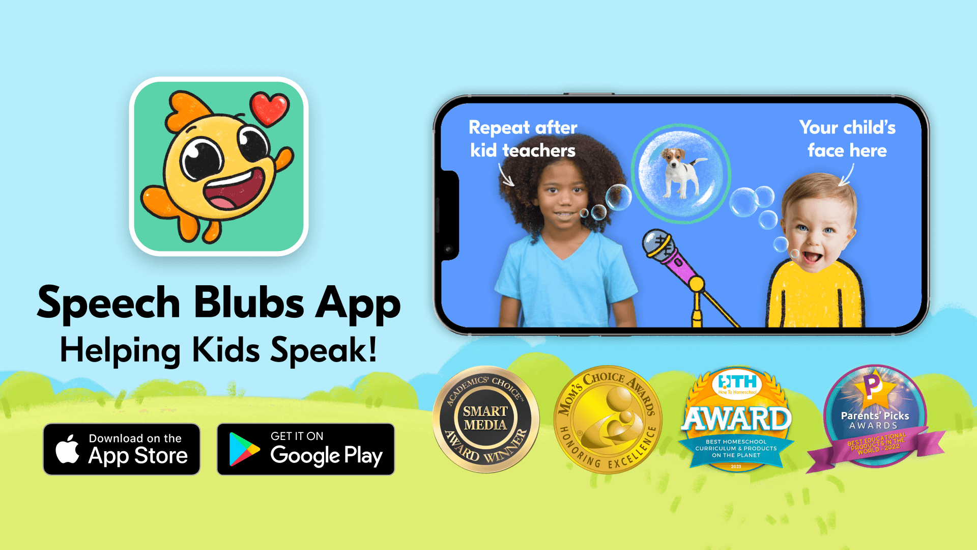
Speech Blubs stands as a voice-guided, free speech therapy app tailored to aid children learn new sounds and words, and honing their speaking skills within an educational setting.
This app has gained notable recognition, being featured in reputable publications like Autism Parenting Magazine, Brisbane Kids, Speech Chick Therapy, Beautiful Speech Life, and The Speech Special Education Teachers. Moreover, it has earned multiple awards, including the Social Impact Award, Mom's Choice Award, and Parent's Picks 2020 Award Winner.
Utilizing educational videos techniques, Speech Blubs offers an effective platform to deal with speech impediments. Notably, it was created in the format of fun games and prides itself on being ad-free and devoid of flashy distractions, ensuring a safe and focused learning environment.
Inclusive Edtech applications design
Let's take a look at the basic principles of inclusive design of Edtech application, or, as it is also called, universal design.
Principles of universal design
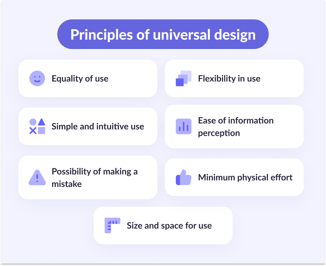
Equality of use. The facilities can be used by both people with disabilities and those without.
Flexibility in use. For example, scissors should work the same for both left-handers and right-handers.
Simple and intuitive use. Anyone without special educational information can intuitively understand how to use the object.
Ease of information perception. Information should be provided to assimilate it equally quickly with different perceptions. It is easier for someone to perceive the text, for someone a drawing, and for someone — to perceive information by ear.
Possibility of making a mistake. According to this principle, when designing an object, it is necessary to consider the errors that the user can make and provide for their commission.
Minimum physical effort. The user should use minimal effort when handling the object.
Size and space for use. For example, turnstiles should be adapted for walking and wheelchair users. To do this, it is necessary to design the size of the turnstile correctly.
Key differences between Android and iOS
The basic concepts of accessibility apply to all (mobile) platforms. The choice of interface and design should make the software product available to everyone. However, each platform has its accessibility solutions. This section describes the main differences between the two major mobile platforms.
Screen readers
Screen readers are often used to convert text to speech to ensure that visually impaired or learning users have access to the same data. This way, users can hear rather than read the content. Screen readers are platform-dependent. Android offers Google Voice Assistant (formerly TalkBack), while iOS offers VoiceOver. Screen readers view the entire user interface as a component. Using gestures, you can navigate these components. Each component highlighted is read aloud. By default, the hierarchy of these components is based on left-to-right and top-to-bottom traversal. The gestures used for navigation are fairly similar across both platforms.
Keyboard differences
There are some important differences between Android and iOS regarding keyboards. For Android, users can operate with a Bluetooth keyboard for navigation. It's like navigating on a desktop computer. However, iOS cannot be controlled with the keyboard alone. VoiceOver must be enabled, resulting in some navigation restrictions compared to Android. Android even supports external braille keyboards when using the BrailleBack accessibility tool.
Legal regulations
The EU is discussing ways to ensure accessibility through government regulation. The European Accessibility Act is a pending law aimed at improving special education services and products. Once this law is fully approved, the European Union will have three years to develop clear rules useful for people with disabilities.
Thus, offering everyone access to your product is not only an ethical task but also an opportunity to stay ahead of the competition in passing formal laws.
Conclusion
By designing your inclusive apps or apps for students with disabilities, you can ensure a good user friendly app experience for all users. Affordability has a wide range of potential financial, moral, and legal benefits. The Android and iOS platforms offer various tools for incorporating accessibility features into your app. There is no reason to ignore the concept of accessibility.
Accessibility is not just a feature. This is a must for every mobile application. If you are interested in developing inclusive educational applications, fill out our contact form, and the team will be happy to create the most convenient application for different kinds of users.


