Design systems are vital for companies that want to document their resources and produce uniform, usable ones. By having everything in one organized area, a design system also helps all employees in an organization visualize and better understand how and why design decisions are made.
Also, design systems are an important item in web development. They help developers create better experiences for users by creating a common language that everyone can follow to communicate with each other.
In this article, we’ll dig deep and help you understand what design systems are and their fundamentals. We’ll also show you how to plan and implement a design system in your organization and present several companies using them to drive success continuously.
In this article:
What Is a Design System?

Let's start with the basics—a design system definition!
A design system is a collection of design assets and rules that dictate how those assets are used. It includes everything from colors, fonts, design principles, and UI elements to how a website should be navigated.
Also, a design system helps present the company’s brand identity and tone of voice. Once the colors, fonts, illustrations, animations, and photos are all unified, they help make a brand unique and recognizable.
Design systems serve two main purposes:
1. Document the design so that others can understand it and build upon it.
2. Create design principles and rules that everyone can follow.
Such systems are also a way to create a common language between designers and developers. They help the company deliver better products for users by developing a more cohesive user experience throughout all platforms and mediums.
Why Should You Use a Design System?

Design systems are a great way to help create a cohesive experience for users throughout your brand's products, from the main website to the smallest app.
They also have several other benefits.
Saving You Time and Money
How? By standardizing the decision-making process. They also help show your team's thought process visually and cohesively, making it easy for any employee who needs to reference the documentation later on.
Helping Designers and Developers Work Better Together
By having a design system in place, designers can create assets that are easier for developers to interpret. This leads to faster turnaround times and fewer misunderstandings.
Becoming an Essential Part of Every Organization
Design systems in web design are becoming exceedingly common every day. As the Internet of Things becomes more prominent, companies rely on their digital presence to make an impact with users. Such systems help designers work faster and smarter while still maintaining high-quality designs. These systems will help your company grow.
Now that you know what design systems are and how beneficial they can be, let’s explore what a design system contains.
Elements of a Design System
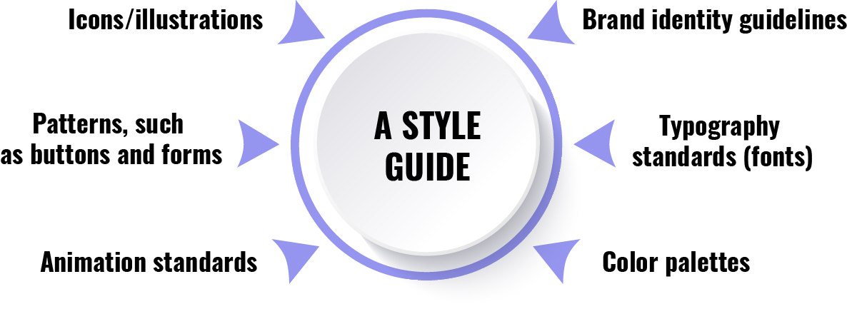
Design systems are made up of several components, including colors, typography, icons, illustrations, animations, and more. There are some basic elements that every design system should include:
- A style guide
- Brand identity guidelines
- Typography standards (fonts)
- Color palettes
- Icons/illustrations
- Patterns, such as buttons and forms
- Animation standards
The more established a brand is, the more likely it is to follow an existing design system. If you’re creating one from scratch, make sure it includes all of those elements plus any others your company needs.
However, the two most important parts of a design system are:
Design System Repository
A design system repository is a place where all of the assets and documentation for the system are stored. This can include anything from brand guidelines, pattern libraries to color palettes to interface elements.
The repository should be accessible to everyone who needs it, including designers, developers, and stakeholders. It should also be easy to use. That way, in design systems anyone can find what they need quickly.
A Design Team
There should be a team responsible for creating, maintaining, and improving the design. It consists of anyone involved in the design process, including the product managers who represent business needs, designers who make wireframes that are turned into designs by developers, and developers who bring wireframe designs to life.
The design team should meet regularly to discuss the direction of the design system, new additions, and improvements. It's also essential for this team to be in constant communication with other teams in order to help build better products, faster processes, and a better experience for users.
Now that the basics are clear, let’s check out more complex information you need to know about design systems.
Types of Design Systems
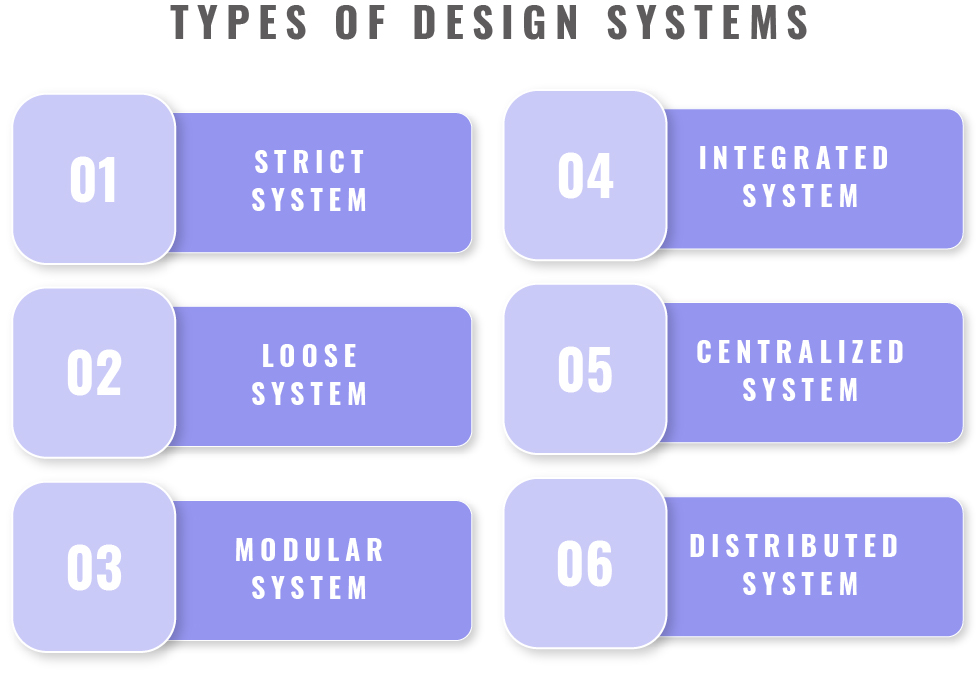
There are many different subsystems. When deciding which is right for your company, the best place to start is by understanding what they do.
Strict System
A strict, also known as a modular, system is one where every element is created to fit together like pieces of a puzzle.
This type of design systems is commonly used by companies with many design assets to manage. For that reason, it features comprehensive and detailed documentation, and it is necessary to synchronize it between the development and the design team fully.
Loose System
A loose, also known as an organic, system is one where elements are not constrained by specific measurements, relationships with each other, or presentation styles.
It is frequently used by companies that have a lot of variable content, for example, websites where users can upload their own content or write posts in the style they prefer. Loose systems leave more space for experimentation.
Modular System
A modular system consists of interchangeable and reusable parts, such as colors, typography, and icons.
Companies often use this type of system to create designs for different platforms, such as websites and apps. It's also popular among companies that have a limited team for design because it's easier to create and manage.
Integrated System
An integrated system is a type of loose system where all the elements are connected and work together.
Companies that want to create a unified look and feel for their products rely on this type of system. It's also popular among companies with a large design team because it gives them more flexibility to experiment.
Centralized System
A centralized system is a type of design system where all the assets and documentation are stored in one place.
Companies that want more control over their design process adhere to this system. It can be helpful for companies with a lot of brand guidelines to manage.
Distributed System
A distributed system is a type of design system where assets and documentation are stored in many different places.
Companies with a lot of design assets to manage where the central team doesn't have control over all the assets, such as individual teams or agencies, rely on distributed systems.
Keep reading to find out which companies use design systems to their advantage (and how), as well as to learn how to develop your own system!
Design System Examples
Numerous companies use design systems to their advantage. Here is how some of the most prominent organizations have developed theirs.
Google Material Design System
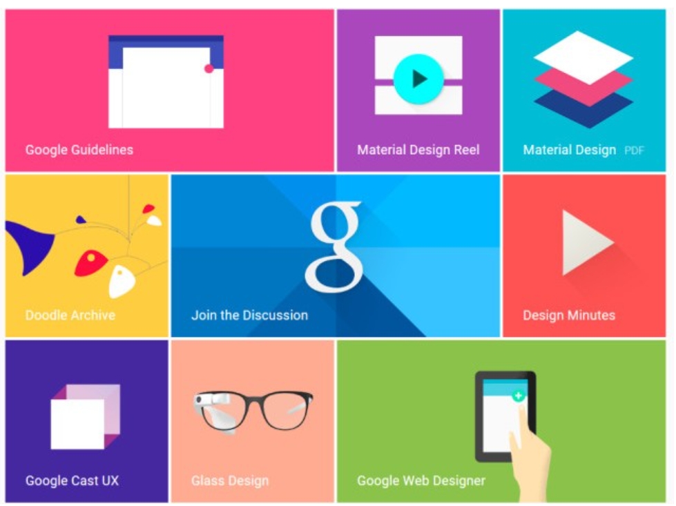
One of the most well-known design systems is Google's Material Design. It was first introduced in 2014 to unify the design of all Google products.
It has been used by numerous companies and apps, such as YouTube, Twitter, and Uber ever since.
Apple Human Interface Guidelines
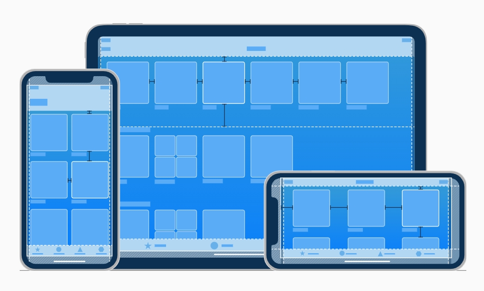
First introduced in 1983 with the release of the Apple Lisa, Apple Human Interface Guidelines have been updated multiple times to keep up with the changing design trends.
Today, they are used by many companies and apps, including Facebook and LinkedIn.
IBM Carbon Design System
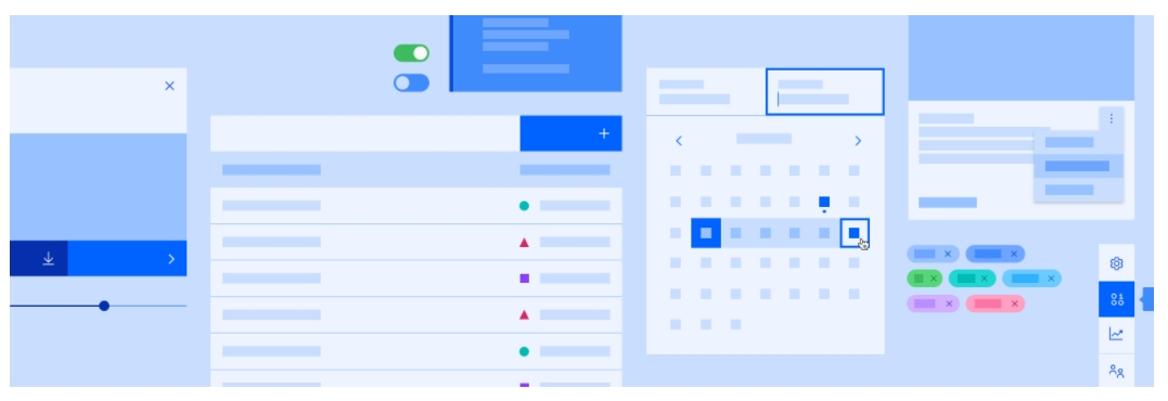
IBM's Carbon Design System was released in 2013 and is used by IBM primarily and numerous companies worldwide.
The main features of the system include navigation, layout, space, typography, pattern libraries, style guides and color. There are also rules for positioning components within a form view and applying different states to it.
Shopify Polaris
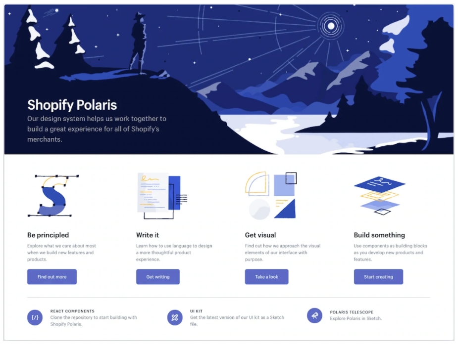
Shopify Polaris was first introduced in 2016. It's used to design and build apps and websites for Shopify.
The Polaris system is based on modularity, which means that all the elements are self-contained and can be used interchangeably. This makes it easy to create designs for different platforms with this style guides.
Buzzfeed Solid State
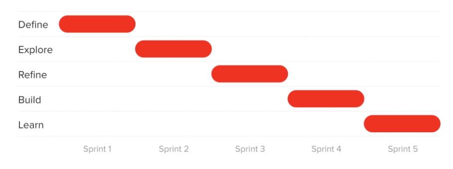
Buzzfeed introduced its own design system in 2016 called Solid State. It was created to keep Buzzfeed websites consistent across all channels globally
Solid State is a modular system where elements are self-contained, which means that they can be used interchangeably.
After learning about these prominent examples of design systems, you might be wondering how to create your own. Let’s overview the development process.
How to Create a Design System
Before creating a design system, it's important to know what you need and why. Ask these questions:
- What is my company trying to accomplish?
- What problems am I trying to solve?
- Who does my company consider the customer, and how will they use the product?
- Which platforms or devices do we need to support?
- Is there a standard way of doing things already?
Once you have a decent understanding of your company's goals and needs, it's time to start creating your system. Here are the steps that will take you through the process:
1. Conduct a visual audit.
2. Create a visual design language.
3. Create a UI/pattern library.
4. Document what each component is and its use.
Now, let's explain each step in greater detail!
Conducting a Visual Audit
The first step in designing your system is to conduct a visual audit. This means looking at all the assets your company currently has and making a note of any problems you see, such as inconsistencies or lack of consistency in style or branding.
When you look at each asset, ask yourself:
- Is it cohesive?
- Does it convey the right message?
- Is it up to date?
- Should you redesign or remove any elements?
Taking note of the CSS and the aesthetic qualities of the components will help you determine how challenging this process will be.
Creating a Visual Design Language
The next step is creating a visual design language. This will include the basic rules for how your elements should look and behave. For example, you may decide that all your typography should be uppercase or that all your buttons should be circular.
The visual design language is made up of four main categories. Make sure to take into consideration the role each of these design UI elements plays in every component on the screen:
- Color
- Typography
- Sizing and spacing
- Imagery
Creating a UI/Pattern Library
Once you have your visual design language in place, it's time to start creating your UI/pattern library. This is where you'll actually create the designs for your system.
Start by gathering all of the components of your UI that are presently in production. Merge and delete what you don't need. Once you're finished, you'll have a clean library of UI elements that are consistent in aesthetics and function.
Documenting Your Components
Finally, document each component by writing out what is on the screen and when to use it. If you are using Sketch, make sure to create symbols for each component, so they are easy to reuse. Also, make sure to include any notes on animation, spacing, and fonts.
How to Create a Design System with Specialized Software
Nowadays, there are a lot of software options that can help you create your design system. Consequently, you can make your life easier by hiring a team that will create a design system for your company by using some of the most popular specialized software.
The Geniusee dedicated team can provide guidance and create a design system according to your company's needs. That’s why 70% of our customers have a genius team of specialists who are selected according to the requirements of the project.
Conclusion
In this article, we explained what a design system is, and we defined it as a set of design guidelines and tools that help make your product feel cohesive.
Creating a design system is an excellent exercise for identifying product design flaws and usability gaps in your product. It can assist in directing your product design team's attention to more critical product design difficulties.
Key components in creating a successful system include understanding your company's needs and goals, creating a visual language, designing the UI/pattern library, and documenting each component.
If you need a quick result with strategy or you're not sure how to start building a design system, there’s a solution! Reach out to see how the Geniusee team can assist you.


