Adapting design to a different platform is an integral part of a mobile application designer’s work. The purpose of this work is to fit the design organically into the patterns of user interaction with the platform. In addition, a well-developed adaptation simplifies development through the use of native platform components.
To adapt the design correctly, you should follow the platform guidelines — Human Interface Guidelines (HIG) for iOS and Material Design for Android. And you also need to communicate with developers, ideally connecting them to the design as early as possible so that they can immediately set technical limitations.
But how exactly is the design for iOS different from the design for Android? In this article I will analyze 18 specific design differences for iOS and Android.
IOS features will be in the left part of your screen , and Android in the right one.
12 differences in iOS and Android App Design
Adapting design to a different platform is an integral part of a mobile application designer’s work. The purpose of this work is to fit the design organically into the patterns of user interaction with the platform. In addition, a well-developed adaptation simplifies development through the use of native platform components.
To adapt the design correctly, you should follow the platform guidelines - Human Interface Guidelines (HIG) for iOS and Material Design for Android. And you also need to communicate with developers, ideally connecting them to the design as early as possible so that they can immediately set technical limitations.
But how exactly is the design for iOS different from the design for Android? In this article I will analyze 12 specific design differences for iOS and Android.
IOS features will be in the left part of your screen , and Android in the right one.
- 01
Human Interface Guidelines vs Material Design
Almost all the differences in this article are taken from the analysis of these guidelines. Their essence at the ideological level is as follows. HIG is about a flat, lightweight, friendly design, and it came from a gradual rejection of skeuomorphism. Material has several fundamental principles:
- material as a metaphor;
- bold, graphic, conscious;
- meaningful animation;
- flexible foundation and cross-platform.
If you are not familiar with the guidelines, it is better to read them before you read the article.
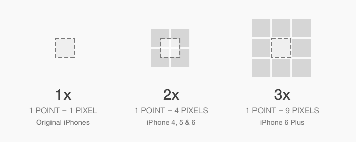
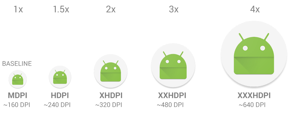
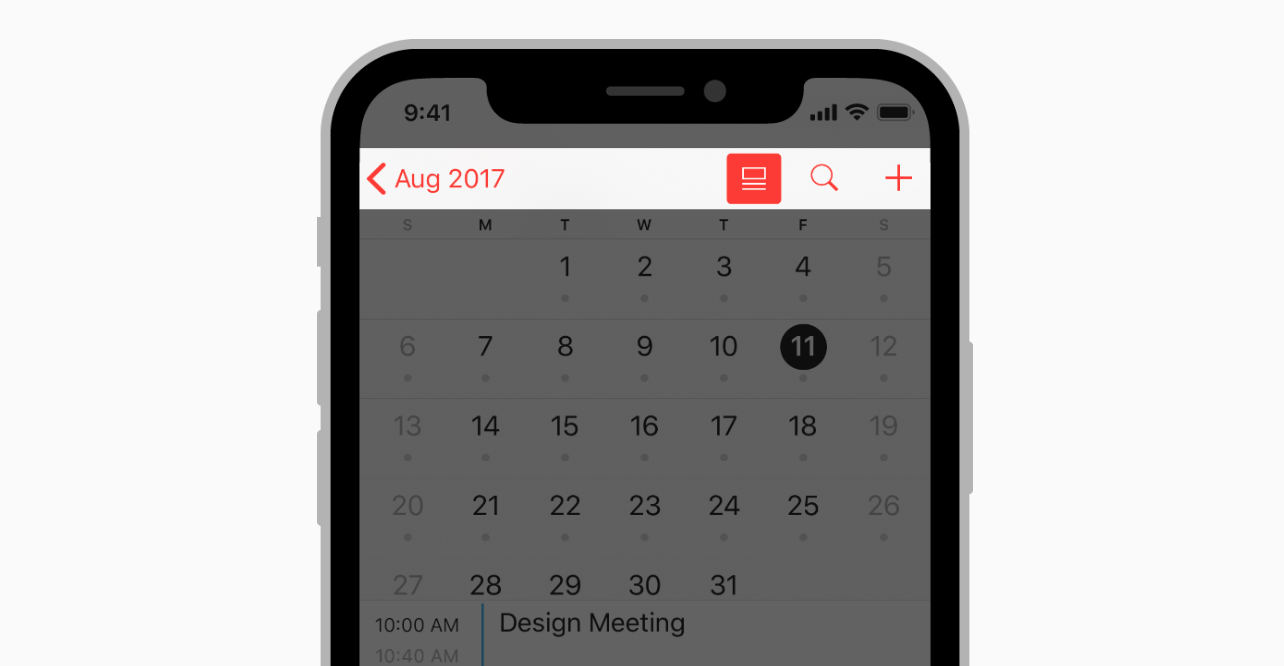
The design of the iOS application is created in pt, and the Android application in dp. As a rule, we create a design in 1x (or mdpi) and upload it to Zeplin. Zeplin displays the design for pt for iOS and generates icons and illustrations in 2x and 3x. Under Android, it displays the design in dp and generates graphics in hdpi, xhdpi, xxhdpi and xxxhdpi.
- 03
Screen Size: 320pt x 568pt vs 360dp x 640dp
Our team prefers to design the iOS application for the smallest size - iPhone 5 SE with a screen size of 320pt x 568pt. We do this in order to avoid incorrect display of content on small screens. Some people prefer to design for iPhone 8.
Android has a generally accepted screen size of 360dp x 640dp.
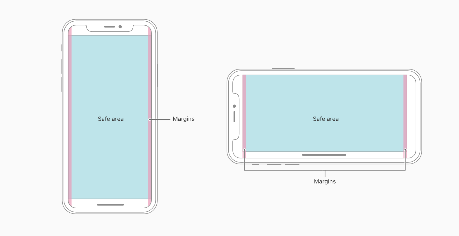
When designing for iOS, sometimes we create a design for iPhone X (375pt x 812 pt). This is necessary for the developer to understand how to indent the screen of this size correctly . Even when designing for iPhone X, you need to remember about Safe area - an area outside which you should not place content.
- 04
Typography on iOS and Android
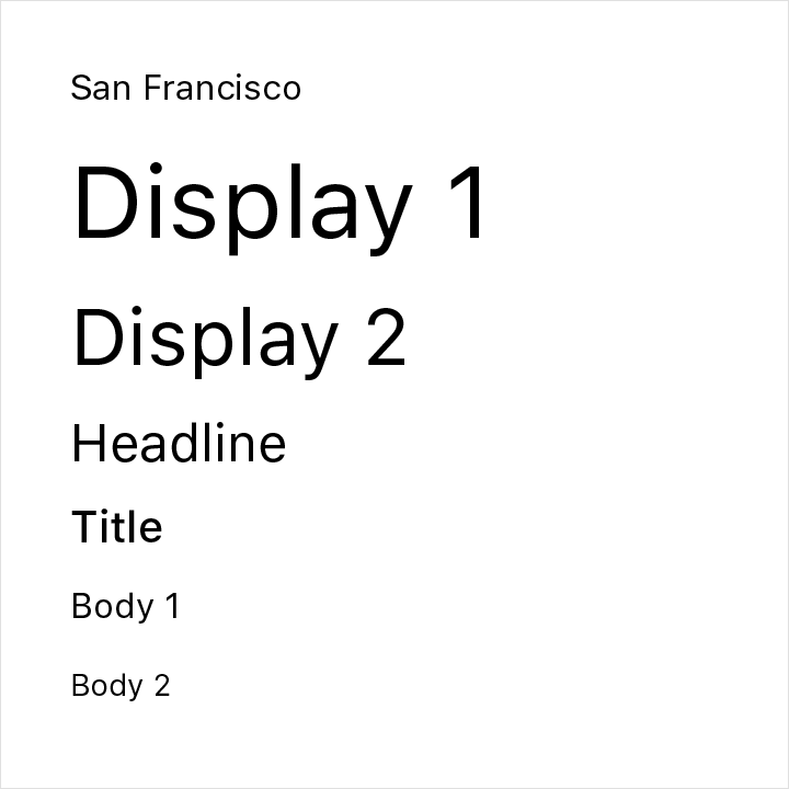
There are not the fonts that you necessarily should use for any of our considered OS. But if you want to imitate the native styles of the Android or IOS app, you may use the Roboto and San Francisco fonts accordingly.
Speaking about more specific font characteristics: the base font for the IOS is 17 pt (body text, small titles, controls), smallest font size should be 10 pt and secondary titles - 15 pt and 34 pt for the large titles.
For the Android, these characteristics will be the next: 16sp for the base font, uppercase titles and labels – 14sp, captions, errors, and other small text – 12sc.
- 05
Android Navigation Bar
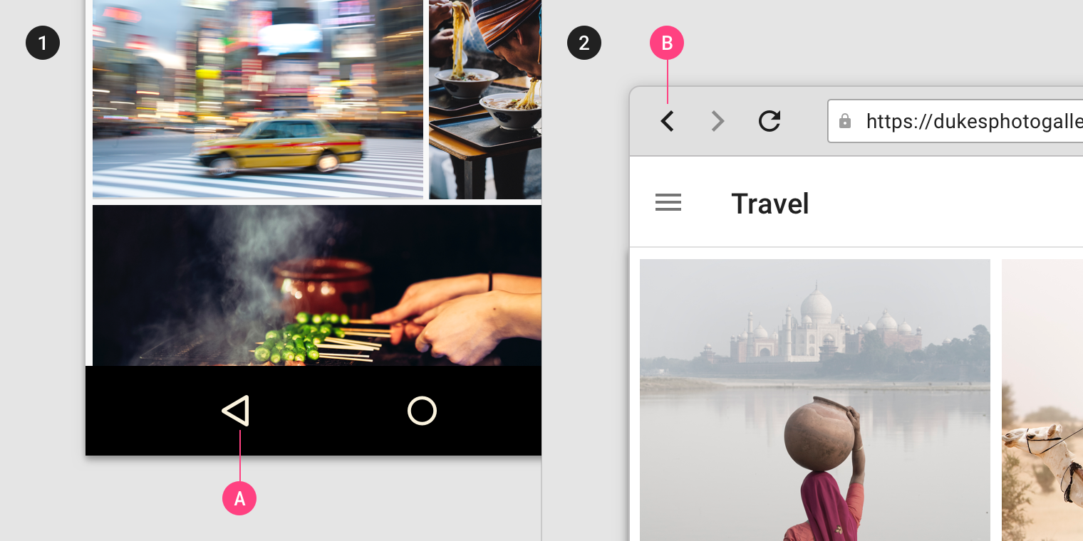
Unlike iOS, Android has a built-in back navigation tool. This is the Android Navigation Bar.
It is either physically integrated into the smartphone, or is a part of the interface. Using the arrow, the user moves one step back in the chronological order (reverse chronological navigation). Navigation occurs both within the applications and between them.
There are two types of navigation back:
- reverse chronological navigation (we do it using the back arrow in the Navigation Bar, call it Back);
- and upward navigation (we do it with the upper arrow, call it Up).
- 06
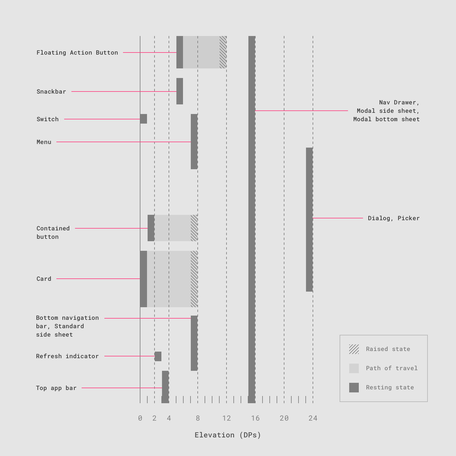
Importance of Elevation in Material
In iOS, there are basically no shadows. As an exception, shadows can be found on the main screen of the App Store and in Health. But in general HIG does not prescribe the use of shadows.
In Material, shadows play a big role. They add a third space to the interface (z axis) that allows each component to have its own strict place on this axis (from 0dp to 24dp). Moreover, this z axis does not exist simply at the ideological level: developers have an elevation parameter in which they set the position of the component along this axis.
Navigation and change of states is accompanied by a change in elevation of components. Therefore, when designing for Android, we should consciously approach the creation of shadows.
There are many differences in naming. We propose to consider these five.
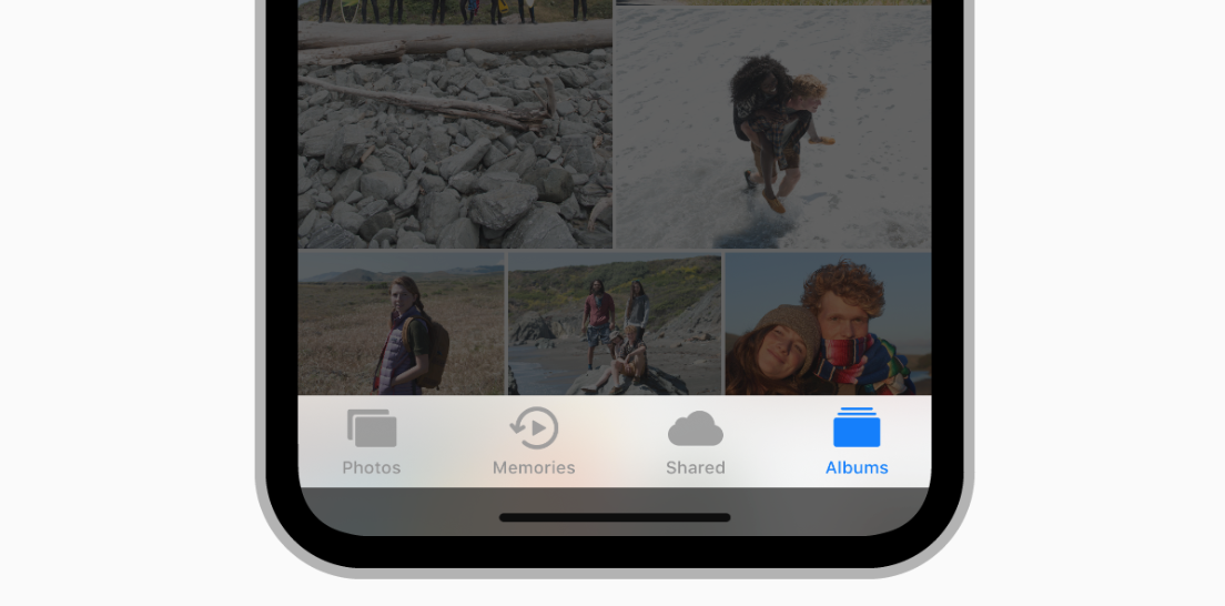
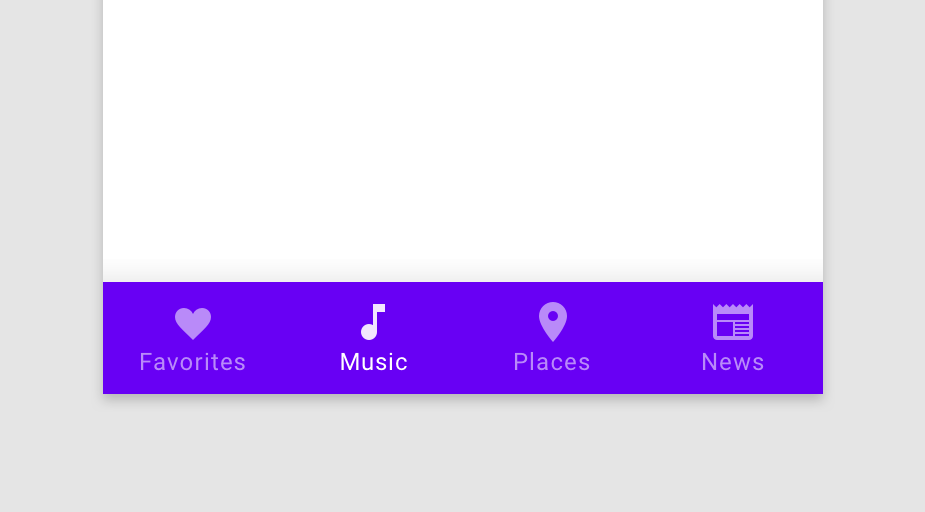
a. Tab Bar vs Bottom Navigation Bar
This is a bar for top-level navigation of the application, statically located at the bottom of the screen on both platforms. In addition to naming, they differ in behavior.
b. Navigation Bar vs Top App Bar
This bar on both platforms performs approximately the same tasks: it informs the user of their current location in the application, makes it possible to return to the previous screen and offers one or more contextual actions.
c. Segmented Controls vs Tabs
In addition to naming, Android Tabs has several other features: you can move between tabs on a swipe, and Material allows you to use them for top-level navigation.
d. Alerts vs Dialogs
Interestingly, only one user alert tool is described in iOS - Alerts. There are three in Android: Snackbars, Banners, and Dialogs. Snackbar is designed for low priority messages and requires no action. Dialogs block interaction with the interface and require action. Banners are located between them: it does not block interaction, but requires an action.
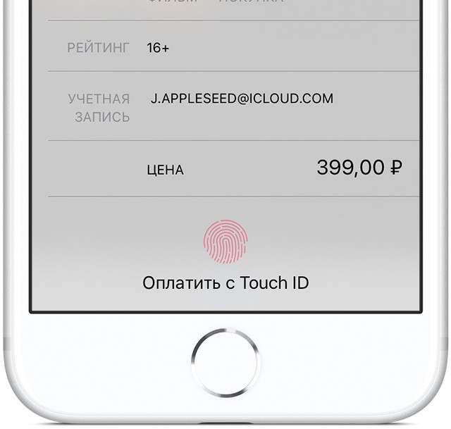
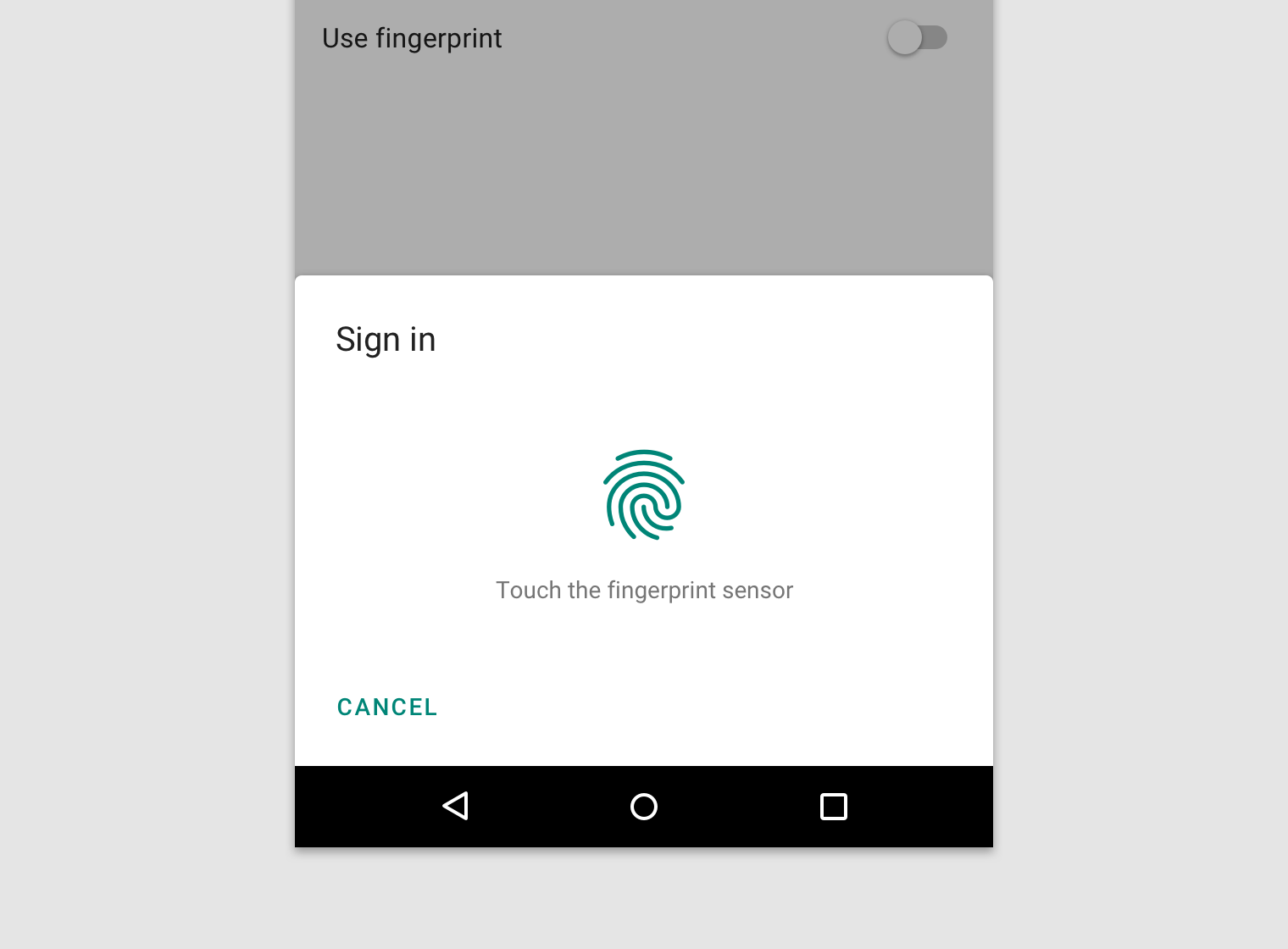
e. Touch ID vs Android Fingerprint
This is just one example of different naming technologies that are used on these platforms. They should be known, because in addition to naming, they differ in many technical features of their implementation. Understanding the differences in naming is the first step towards understanding the differences in technology.
- 08
Top level navigation methods
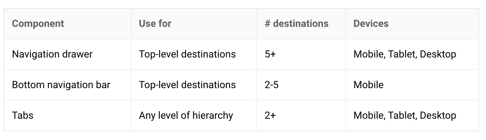
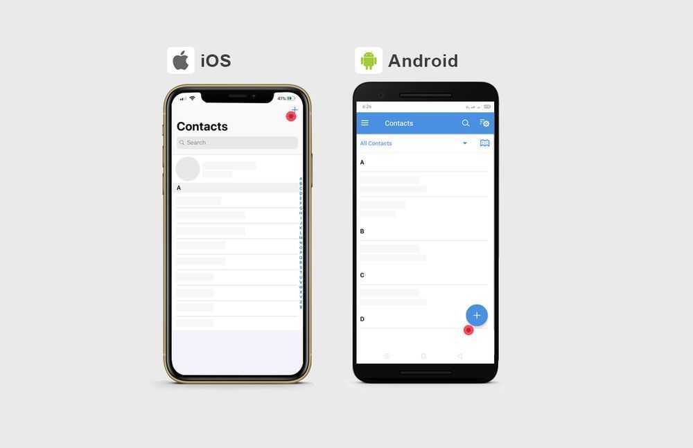
Let's start from the top. iOS recommends only one way of top-level navigation - through the Tab bar. Android has three options in return: Navigation Drawer, Bottom Navigation Bar, and Tabs.
If the number of top-level pages is more than 5, we use Navigation Drawer. If less - Bottom Navigation Bar. Tabs are not often used for this navigation, but the method is available to us.
On both platforms, the Status Bar performs the same task,- it reports on time, charge level, quality of mobile communications and Wi-Fi. They differ in the location of these indicators inside the Status Bar and, in general, in a common solution.
Android Status Bar also has one more feature - when a notification comes from an application, the icon of this application appears in the Status Bar. In iOS, there is no feature of this type .
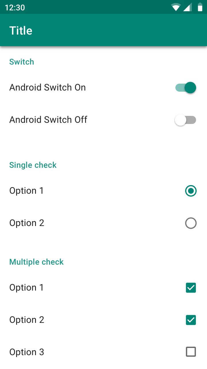
Platform controls differ only visually. It can be noted that in iOS controls are simpler: checkboxes are used for both radiobutton and Checkbox. In Android, they differ in the form of control.
- 11
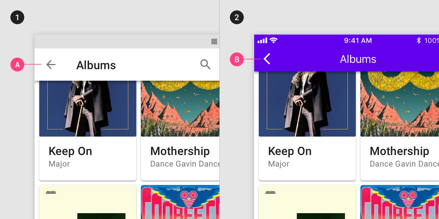
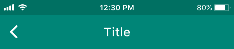
Different types of back arrows and heading position
In iOS, the arrow does not have a line in the middle because in iOS, the back arrow is signed by the previous screen. If the title is standard on the previous screen, then the title moves from the title to the left to the arrow. If the title is wide, then the title rises. If the title of the previous page is too long, it is replaced by the word back.
- 12
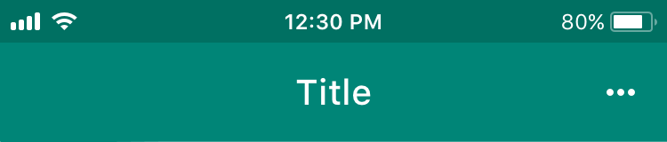
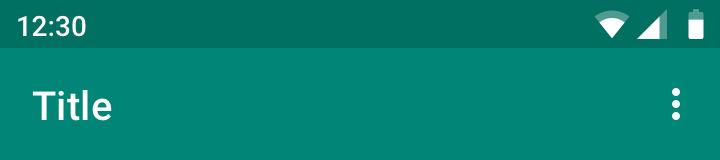
Different three dots icon
There seems to be no rigorous justification for this difference. We pay tribute to the platform and use the recommended position of the three points. In iOS, the dots lie horizontally, in Android - vertically.
- 13
Call-to-action buttons
On iOS, the page's CTA button will usually be in the upper-right corner. On Android, the page's CTA button will often appear in the bottom-right as a floating action button (FAB).
However, each platform will still have exceptions.
Sometimes on iOS, an important primary button appears on a bottom toolbar. Alike, from time to time on Android, CTA will appear at the top of the screen.
- 14
Search on iOS and Android
Search on either IOS and Android has the same characteristic: it can have a very variable use, but still is very common control.
Occasionally, it's the core point of the app. Sometimes, it's just one of the navigation options, but it's usually in the middle of these 2 cases.
So, there're the common paradigms for both of the platforms:
If the search control is the primary point of the app, it will be displayed right away, and tapping on it will open an entirely separate page.
When this element isn't so important for this service, you can get to it through other places.
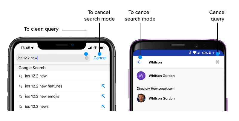
The tiny difference between Android- and iOS- view search is the next:
On Android, you should press the «back arrow» in the search field, and on IOS, the «Cancel» text button is for this action.
To clear the present text field but stay on the search mode page, you should press the "X" button on iOS and Android.
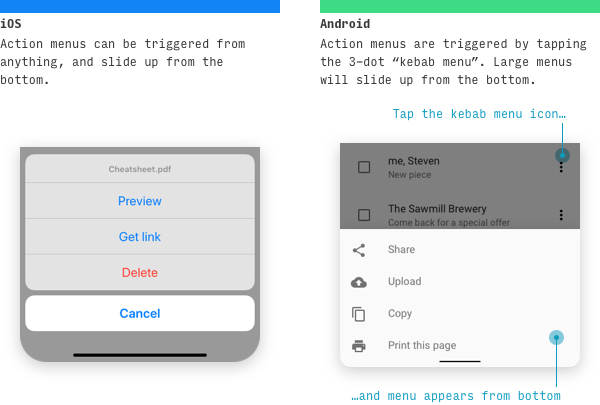
On iOS and Android, the action menu has a different pattern of appearing, but both appear in the same place.
The IOS action menu can be triggered from any action and anything but always slide up from the bottom.
When it comes to Android, the action menu appears only by tapping the «hamburger» (means «more option» element) 3-dots menu. The big menu will appear from the bottom. And sliding up from the bottom usually only happens when there are several possible actions.
Also, there are on-action menus (small blocks with quick action with a specific element of the app) on both platforms. Each platform has its standards for that element.
Starting from the 13th version, this on-action menu appears on the IOS when the user taps and holds some of the elements. It's named «context menu», and it has related actions with elements that you hold. During that action, the screen of the app is blurred.
On the other hand, the Android context menu isn't separate from other elements on the screen with the blurred background and appears right on the element. In the new Android version, this menu is covered in 3 dots «hamburger» menu.
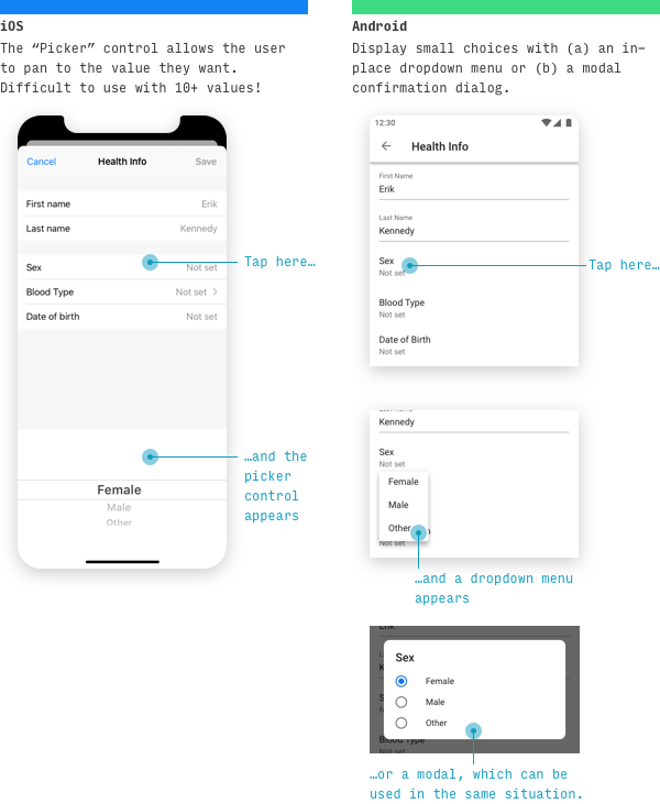
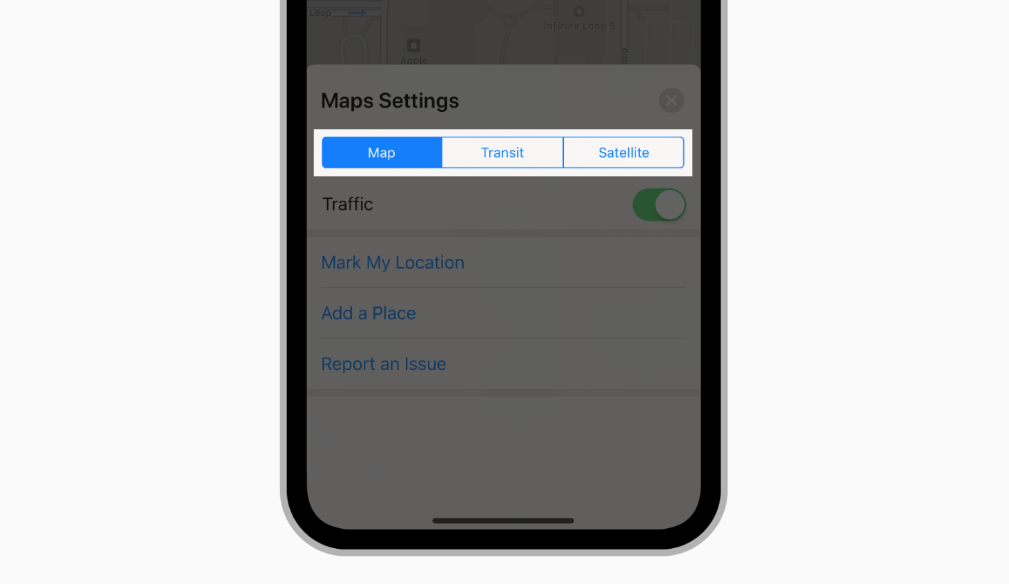
There're some variabilities for the IOS and Android selection controls. If we speak about the choice picker (namely, a window with multiple answers, with the ability to choose one), they are the next. iOS uses the large full-width picker that appears at the bottom, anchored to the base of the screen. Occasionally, it can be shown in line with the content.
For Android, the same element looks a little bit different. Commonly, it looks like the pop-up in the center of the screen with blacked or/and blurred background or as a drop-down menu near the selected input.
On both Android and IOS, if there are multi-selection available or too many options, a separate "picker screen" is used.
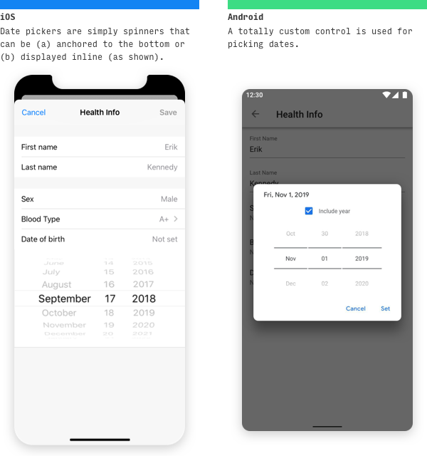
The difference between the appearance of Android and IOS date picker is that Android has its own custom date picker – that has a view of the centered modal calendar with the ability for the user to decide to do what they want to include the year there or not. IOS for choosing the date has the same elements as any other choice-picker control (full-width screen at the bottom of the screen).
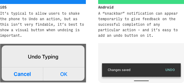
IOS uses for the «undo operation» shaking the phone, which is pretty not obvious for newcomers, so there should be a more noticeable way to show this opportunity to the users – with the modal centered screens on the dark background or the alerts slide up from the bottom. It will be demonstrated to the users unless they take some action: press one of the available buttons.
Android manages this situation the following way: it shows the "snackbars" – brief messages about app processes at the bottom of the screen. The cool thing is that they don't demand any action from the user (unless the user wants to do this action - as, in our case, undo some operation). They appear temporarily towards the bottom of the screen. They shouldn't interrupt the user experience, and they don't require user input to disappear.
You can add the single option to the snackbars – «undo» in our case.
.svg) What are you searching for?
What are you searching for?


