We have been creating designs for over 8 years. There are not very many objective and verifiable laws in graphic design as well as in UX/UI design, and when we needed to find out something, we looked for information in professional books, blogs of cool guys, and asked art directors we knew.
And then we learned that scientists had already figured out a hundred years before what the designers are still arguing about.
At Geniusee, we compared the opinions of famous designers and science font opinion about serif vs sans serif readability.
Why did we do this?
One day, our design team thought about how to choose a font. We found it better to use serif fonts for large texts, because the eyes fatigue less and serifs help keep the line in line.
Then the designer’s team lead came and uttered his frequently asked question: “Proofs?”
“It’s obvious,” we thought, and opened Wikipedia:
The conventional wisdom is that serifs guide eye movement along lines when reading large volumes of printed text. They facilitate the connection of letters into a single line, making the text easier to read.
There were no proofs on Wikipedia, so we went to the bookcase.
In my opinion, serif typefaces less fatigue during long reading of regular, “paper” editions than grotesque, for two reasons. Firstly, serifs emphasize the endings of strokes, becoming additional “sense-discerning”. Secondly, serif letters are somewhat more complex in shape, so they differ more from each other than grotesque ones. And our reader’s eye is more in need of a balance of individuality and unification than a designer’s eye, which enjoys mirror ideality.
Yuri Gordon “Book of letters from Aa to Ya”, Where did they come from and why do we need serifs, p. 51
In general, the personal view of Yuri Gordon is a pretty strong argument, but nevertheless, we still looked in the articles of Jan Tschichold:
A sans serif font only seems to be the simplest. Its shape has been specially simplified for children, and it is more difficult for adults to read it than an Antiqua, because serifs are not only for decoration.
Jan Tschichold “The Form of a Book”, On Typography, p. 21
Jan Tschichold
The books did not help us much with sans serif vs serif readability, and we tried to use scientific articles to figure out if there is any evidence that serif is easier, faster or more enjoyable to read than sans serif. Of course, this is not complete scientific research, but it is better than the “conventional wisdom”. So let’s have a journey to understand what is the best font for reading.
Concepts: legibility vs readability
Font legibility depends on the accuracy of its elements, which usually means the ability to recognize individual letters or words.
Readability of serif font vs sans serif is directly related to the optimal layout and structure of the entire body of text.
Serifs guide the eye along the line
Wikipedia and a million other design articles say serifs guide eye movement along lines when reading large blocks of printed text.
Here you need to know that the eyes do not move smoothly. When we read or search for an object in our field of vision, the eyes “jump” from point to point, making rapid movements called saccades.
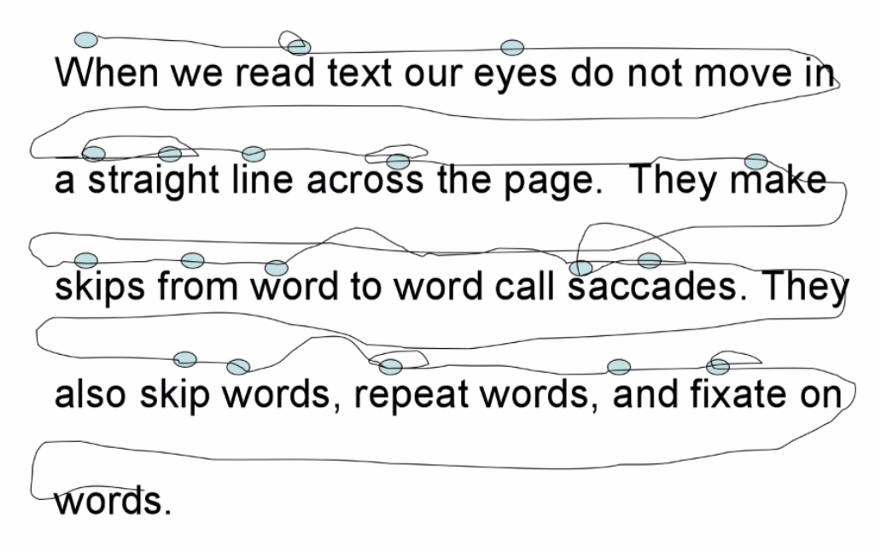
Moreover, the eyes perform saccades even when a person tries to focus strictly on one point.
Jaret Screws conducted an experiment: he asked 10 people to read several texts and followed the movement of their eyes using special equipment.
Here’s what happened:
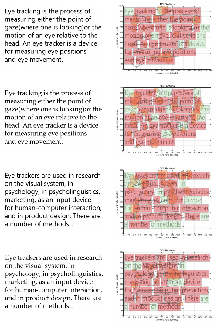
They measured the duration of gaze fixation, the average number of words between them, the amplitude of saccades, and the number of times a person lingered on the same word.
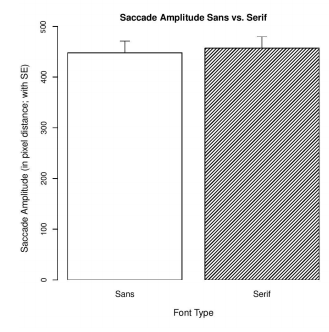
All differences were found to be insignificant. Oh… Then it seems that the hypothesis that the gaze moves more easily over serif text has not been confirmed.
Serif and sans serif fonts equally “hold” the line
There is a catch though. The test used a 128 pt font. This is ten times more than in a regular book, and perhaps the research is not very well applied to the usual reading process.
Quantitative Analysis of Font Type’s Effect on Reading Comprehension Jaret Screws Clemson University Clemson, United States.
Children find it easier to read sans serif type than adults
Even if this is not so, the manufacturers of the alphabet definitely believe in it. Try to find at least one alphabet with Antique.
The scientists took 80 children who were 10 years old and 80 children two years older, asked them to find the right word in the text (screening test) and measured how quickly the children did it.
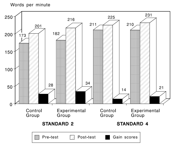
The control group was given the same font both times, and the experimental group was given first serif and then sans serif.
The differences are statistically insignificant, and the authors say there doesn’t seem to be essential difference in child legibility between serif and sans-serif fonts.
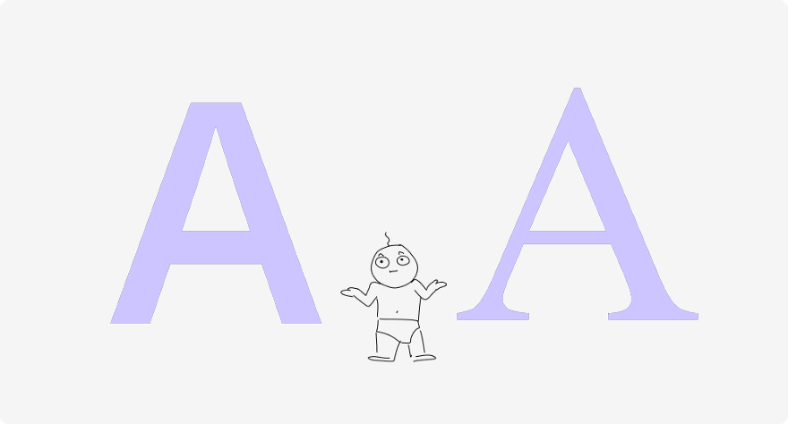
Performance differences between Times and Helvetica in a reading task Rudi W. De Lange, Henry L. Esterhuizen and Derek Beatty.
What about guys with poor eyesight?
There is a lot of research on visually impaired people and typefaces. The Journal of Visual Impairment and Blindness published a review of 18 studies in which the total number of subjects was more than 1500 people. The researchers’ conclusion: For people with low vision, sans-serif fonts such as Arial, Helvetica, Verdana or Adsans are more readable than serif fonts.

The Legibility of Typefaces for Readers with Low Vision: A Research Review Elizabeth Russell-Minda, Jeffrey W. Jutai, J. Graham Strong, Kent A. Campbell, Deborah Gold, Lisa Pretty, and Lesley Wilmot.
Fonts and dyslexics
It is difficult for people with dyslexia to read. Will it be possible to make their life easier with the help of some fonts?
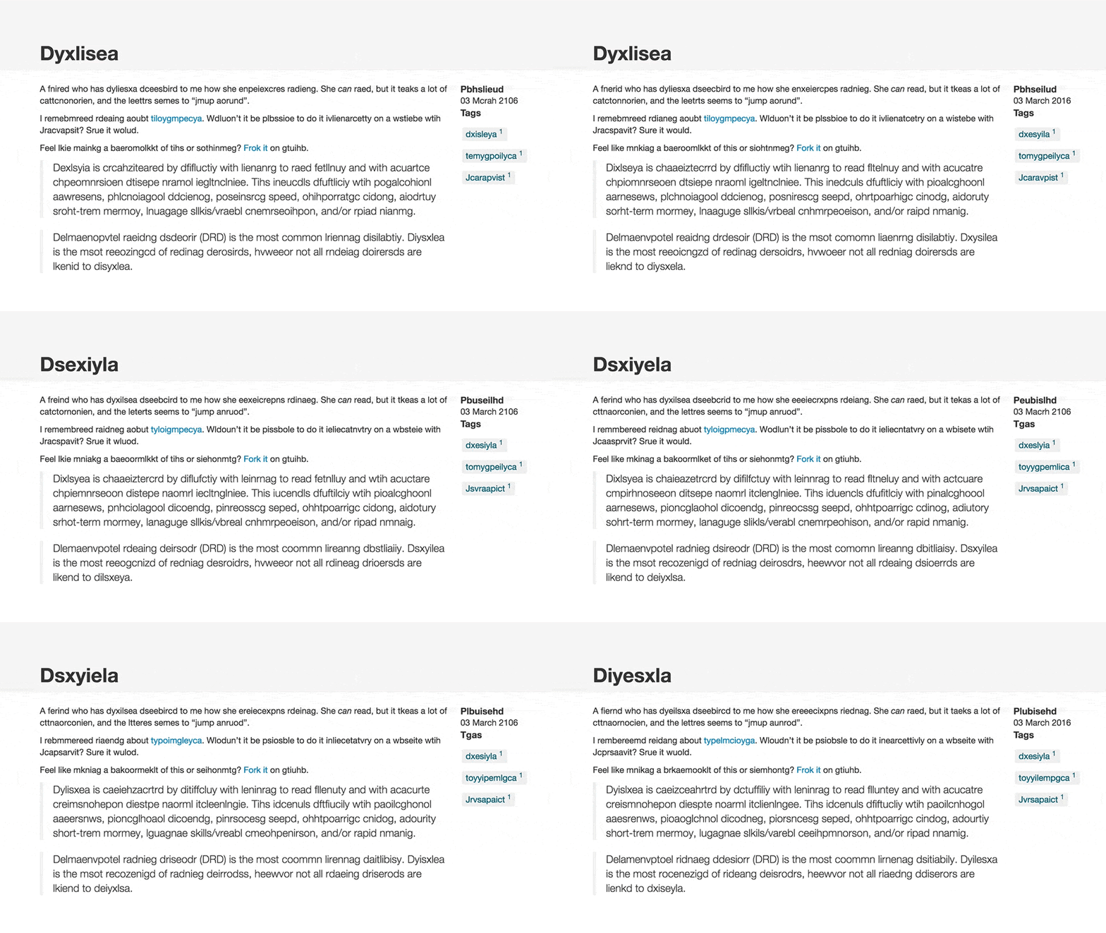
A page that displays text as people with dyslexia see it at dyslexiarf.com
Scientists, using technology that monitors eye movement, examined 97 people, half of whom had dyslexia. They were allowed to read 12 similar texts typed in different fonts, measured the speed, number and duration of gaze stops, comprehension of the text, and using questionnaires to find out the preferences of users.
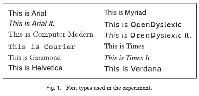
The sans-serif font Arial came out on top as the best reading font for both ordinary people and dyslexics (interestingly, Helvetica, which is similar to it to the point of being indistinguishable, is in fourth place). But the second place was unexpectedly taken by the monospaced squared Courier.
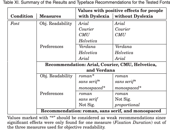
The preferences of people are generally unambiguous: the top 3 fonts for both dyslexics and non-dyslexics are sans serifs.
The Effect of Font Type on Screen Readability by People with Dyslexia LUZ RELLO and RICARDO BAEZA-YATES.
Emotions and fonts
Maybe it’s not about reading speed and legibility, but the special mood that serif fonts create?
The Software Usability Research Lab at Wichita State University tried to figure out how people perceive fonts. Participants filled out a questionnaire where they indicated what, in their opinion, characteristics of different fonts.

Interestingly, serif fonts were ranked first as formal, mature, practical and stable. And sans serif fonts came first in the ranking … nowhere. That is, they did not have any pronounced emotional trace.
Perception of Fonts: Perceived Personality Traits and Uses By A. Dawn Shaikh, Barbara S. Chaparro, & Doug Fox
For another study, they took two satirical passages from the New York Times: one on government issues, the other on education policy. They were printed in the same size Times New Roman and Arial fonts and shown at random to 102 university students who graded them using predefined adjectives.
The satirical articles printed by Times New Roman were perceived as funnier and more treacherous than those printed by Arial.
Emotional and Persuasive perception of fonts Samuel Juni, Julie S. Gross.
This is most likely the same sans serif neutrality effect as in the first study.
Does this mean that all sans serif fonts are faceless? Generally not, but a neutral serif is less neutral than a neutral sans serif.
Fonts readability on electronic screens
We read most of the texts from electronic screens. Electronic devices and even different programs on the same device handle fonts differently.

Scientists have tried to figure out how anti-aliasing affects readability. They compared four fonts printed on paper and on-screen, with and without anti-aliasing.
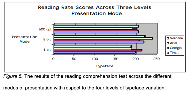
Interestingly, the most readable was the anti-aliasing screen font (not printed), and that sans-serif font is Arial. The second after him is Verdana, also sans serif.
But without anti-aliasing, Georgia, a serif font, was best read.
A STUDY OF THE READABILITY OF ON-SCREEN TEXT By Eric Michael Weisenmiller.
Summarizing the difference between serif and sans serif fonts
Typefaces can tell a lot about what you’re looking at. For example, a typeface on a logo can provide insight into the history of a company and its relationship to its audience. The type in advertising materials can hint at what audience the ad is intended for, and the type on the covers of books and movie posters can hint at their genre. As you may have understood earlier, choosing the right font for a specific project is not easy, so first you need to decide which font is better to use – Serif or Sans Serif. Below we will tell you a little more detail about sans serif vs serif typeface and how sans-serif differs from the serif.
Serif font
Serifs are a typeface characterized by decorative letter legs. In other words, this font is easily recognizable by the small lines that extend beyond the edges of the letters typed in this font. Serif is a typeface believed to date back to the time of the Romans, who decorated their letters by engraving them on stones. Stone engravers made these long lines to carve letters and alphabets neatly into the stone. The word serif is believed to be derived from the Dutch shreef, meaning a line or stroke of a pen or pencil.
Sans serif font
Sans is a French word meaning “without”. Thus, a sans serif is a typeface that has no traces or lines extending from the edges of letters and alphabets. This way, there are no curls, and the sans serif letters appear simple and rounded. The Sans font is clean and the best font for reading on screen. The sans font does not have decorative feet for the letters, but it looks neat and elegant. Verdana, Arial and Tahoma are some of the good examples of sans serif fonts.
Main difference between serif and sans serif
- Actually, serif and sans serif fonts can be used for most fonts.
- Serifs are characterized by decorative letter legs that are absent in sans serifs.
- Serif is the Dutch word for shreef, which means line or stroke of a pen.
- Sans is a French word meaning “without”.
- Sans is considered simple yet elegant, while serifs are heavy and decorative.
- Serifs are better for printing, while sans serif are better for on screen.
- While Arial is the best example of a sans serif font, Times New Roman is the best example of a serif font.
Our approach
Creating an ideal UI / UX project is impossible without a well-oiled process that combines a number of interrelated stages:
1. Strategy formation. We define business tasks and user needs, form a UX strategy.
2. Formalization of requirements. The strategy is transformed into a set of clear, formalized requirements for the system and interface.
3. Information architecture. We think over the information architecture of the project, taking into account the functional specifics and the importance of providing convenient and quick access to content.
4. Interaction Design / Prototyping. For each unique template of the future project, a prototype is created, which is then adapted for mobile devices.
5. Interface design. A design concept is developed, on the basis of which the design of all screens of the application or pages of the site is created. The interface takes on the appearance of a finished product.
The Geniusee team knows how to build user-friendly web and mobile apps. We also know how to engage the user in an effective interaction with the product. Our designers also have experience in choosing the right sans serif or serif for web and mobile applications. Skillfully working with the information architecture of the project, we organize logical paths of user transitions and get a truly unique designing interface.
You can find out more about the service on the UI / UX design services.
Subscribe to our newsletter
Conclusions
We wanted to test if it’s really better to use serif fonts for large texts. It turned out that for the average person there are almost no differences, but for those who have problems with reading – the elderly, children, people with poor eyesight or dyslexia – sans-serif is preferable.
Here, we have given reviews of just a few articles. We looked through a couple of dozen more, but did not include them in the article so as not to make it endless. In fact, there are even more of them. But the result is about the same in all: either the differences turn out to be statistically insignificant, or the grotesques are slightly ahead of the serif.
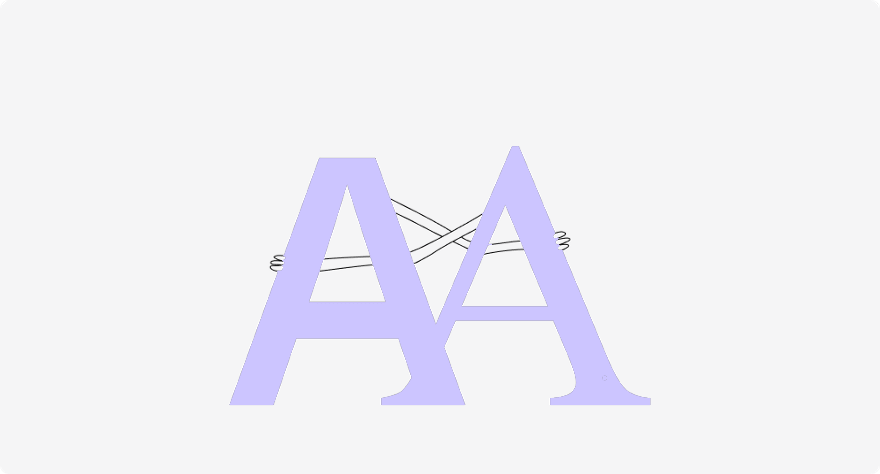
If you are interested in this topic, you can do your own research: search scholar.google.com on request such as Font readability research. There you can find studies about the optimal line spacing, and about the perception of different typefaces, and about the differences in readability depending on the size.

