The interface is a kind of "bridge" between the user and the system. Understanding human-computer interaction is fundamental to creating effective user interfaces. With correct interface, the user will be able to explain the system what they want from it, and the system will do it. But what happens if this understanding between machine and man is not achieved? The user will simply leave the site. Prioritizing user satisfaction in interface design not only retains customers but also attracts new comers.
This is how Internet users behave according to the Online Marketing Institute:
85% can leave the site if they don't like the interface design
83% will leave the site if they have to make a lot of clicks to find what they need
40% will never return to the site if it is difficult for them to use it the first time.
The principles of a good interface are the same for websites, programs, and services. We have collected 16 main ones on how to create a user-friendly design (and at the end you will find a small overview of how to test the interface for usability).
What is a user-friendly interface (UI)?
“User-friendly” is an interface that is created for a specific group of people or without a clear target audience, but is aimed at maximum user convenience.
The main goal of a user-friendly UI is to provide a perfect user experience. So that after installing the application or using the site, only positive emotions remain. If you manage to achieve this effect, the conversion will be high.
Data from numerous studies of web analysts show that almost half of the audience doesn’t give a second chance to an interface that did not live up to their expectations or turned out to be too difficult to understand. Instead of wading through obstacles to solve a problem, most people will try to find an alternative.
It is believed that a user-friendly interface should only be simple. In fact, this characteristic alone is not enough to fulfill the commercial goals of the company. The product must be useful to the audience, otherwise no one will use it. Especially, if there are other solutions on the market.
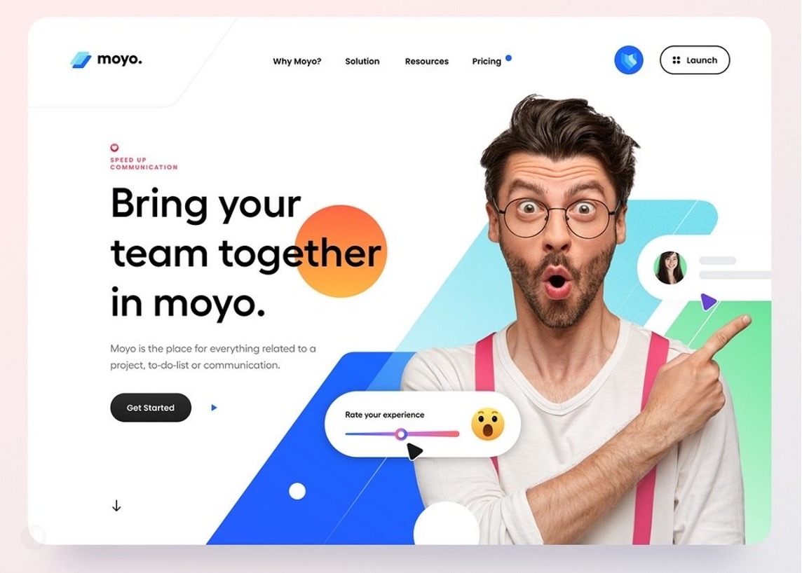
A friendly UI should establish a strong connection with users and show them what is useful for solving everyday tasks. Here you can order a product, send a letter or read a book.
Designing an interface that is ideal for solving specific problems while serving the corporate goals of a company is not easy. It is necessary to design it so that it would be possible to understand the features and reach the final point without lengthy training.
To keep a user on a website or application for as long as possible, you just need to create a comfortable atmosphere and, of course, convenience on various devices such as mobile and tablet. This should be done so that after the first acquaintance there is a desire to launch the application or visit the site constantly.
16 techniques to create a user-friendly interface design
A friendly interface helps users to solve their problems and does not impose other actions. If something goes wrong during the use, most of the audience will refuse from further interaction.
Many designers know that user experience is influenced not only by typography, beautiful animation or customization, but also by how the customer journey is built. If there are constant distractions while completing a task, the company should not rely on the product's commercial success.
To understand better how to create a user interface, analyze its main characteristics and think what is the best way of implementing each attribute within the interface.
A good interface should:
1. Be intuitive
The user interface is something that should be as clear as possible to most people. If a person, having opened an application or visited a website, does not understand how to use it or doesn’t understand app / website navigation, then after pressing different buttons at random for a few seconds, they will be disappointed and leave the resource. Most likely forever.
An intuitive interface is one in which:
All elements are built according to the principles of elementary logic and are easy to use.
Take, for example, a site with text content (articles). Its logical interface will be like this:
The name of the site is at the very top of the page, below it is a short description of the resource.
A menu with sections of the site is below.
A block with contacts and feedback is in the upper right part of the menu
Articles are arranged in the order they were added to the site.
At the end of each article, there are "next" and "previous" buttons.
Category button shortcuts should always be visible so that you can go to another section at any time.
Site rules, detailed contact information, information about developers, etc. are located in the website’s footer, since this is where they are always searched for.
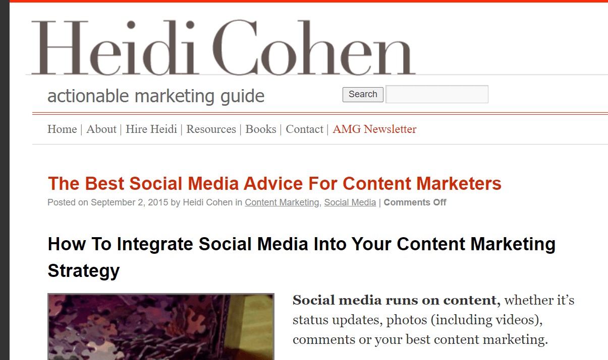
Don’t confuse the user with the non-standard arrangement of familiar blocks, use proven principles. As an example, you can take marketer Heidi Cohen's blog which is structured in a clear and logical way:
The buttons are labeled clearly
Avoid buttons that may be misleading. There is no need to reinvent the wheel. A large question mark immediately tells the user if there is any guidance or help behind it. A magnifying glass is always a search form on a site.
But what would you think if you saw a button on a website or in a program, for example, with a crossed-out square? Most likely, many users will not even dare to click on it, since they will not understand what this action will lead to. When creating a user-friendly website/app, you should think about the users’ better understanding of their actions. For example, you can use button captions that appear on hover.
And for the users’ better understanding of their actions, you can use button captions. They appear on hover.
There is the help to the user if he is “lost”.
If users get to the 404 page, immediately give them a short instruction on what they can do next. For example, invite them to go back to the previous section and look for the information he needs there.
Let’s consider another example - you have an online store. If the product parameters are entered incorrectly, the user sees an error message. Give them clear instructions right there about what they should do to describe the product correctly. If the desired product is not in stock, write about how the user can receive a notification about the appearance of this product.
2. Be predictable

In some situations, predictability may be boring, but not when we build a user-friendly UI. Looking at this or that interface element, the user should immediately understand how it will behave in the event of interaction. If the object looks like a menu, it should behave like a menu; if it looks like a slider, then it should move something accordingly. Creative thinking is, of course, good, but not in this case. Consistent user interface design helps in creating a sense of familiarity and ease of use.
Here is an example of the interface design of the player program. The upper buttons (“previous” – “play” –“next”) should perform exactly these functions, and the slider should change the volume level.
A few more examples. If you make the buttons bulky, they will look more like buttons, so they will be more likely to be clicked:
And the on/off switch looks understandable when done like this:

One of the designers’ biggest fears is that they will be considered unoriginal. That is why they often avoid using techniques that have long been proven effective and work in favor of making “something new and creative”. Of course, there is no need to openly plagiarize. But using the interface design models already familiar to users is a surefire way to make it predictable. What resources does your target audience most often use? Facebook, LiveJournal, Twitter, Amazon, Youtube? Use a similar style in your interface so they can feel like they are in a familiar environment. For example, if you are targeting YouTube users, make the main menu vertical and place it on the left of the page, and center the search bar at the top.
3. Be minimalistic

Trying to place as many categories, menus, buttons, etc. in the interface as possible, you will only do great harm to it. An overly cluttered interface is a big obstacle to the user’s understanding. Anything that can be described in one phrase should not be described in three. Extra elements and subcategories on the main page are also useless. Testing will help you determine which ones are "superfluous" and which are not (see how it can be done at the end of the article). But you shouldn't sacrifice something really important - if you know that without some explanation or an additional button it will be difficult for the user to navigate the site, then leave the button in the interface, but accompany it with as few words as possible.
4. Load quickly
A fast-loading interface significantly boosts user satisfaction by providing the information users need without delay. Slow loading of the interface will annoy and repel the user, causing them to increasingly dislike the resource. Make sure the download speed is optimal for your comfort. To a large extent, this is related to the previous point — after all, the fewer “heavy” elements on the site, the faster it will load.
5. Show all important options
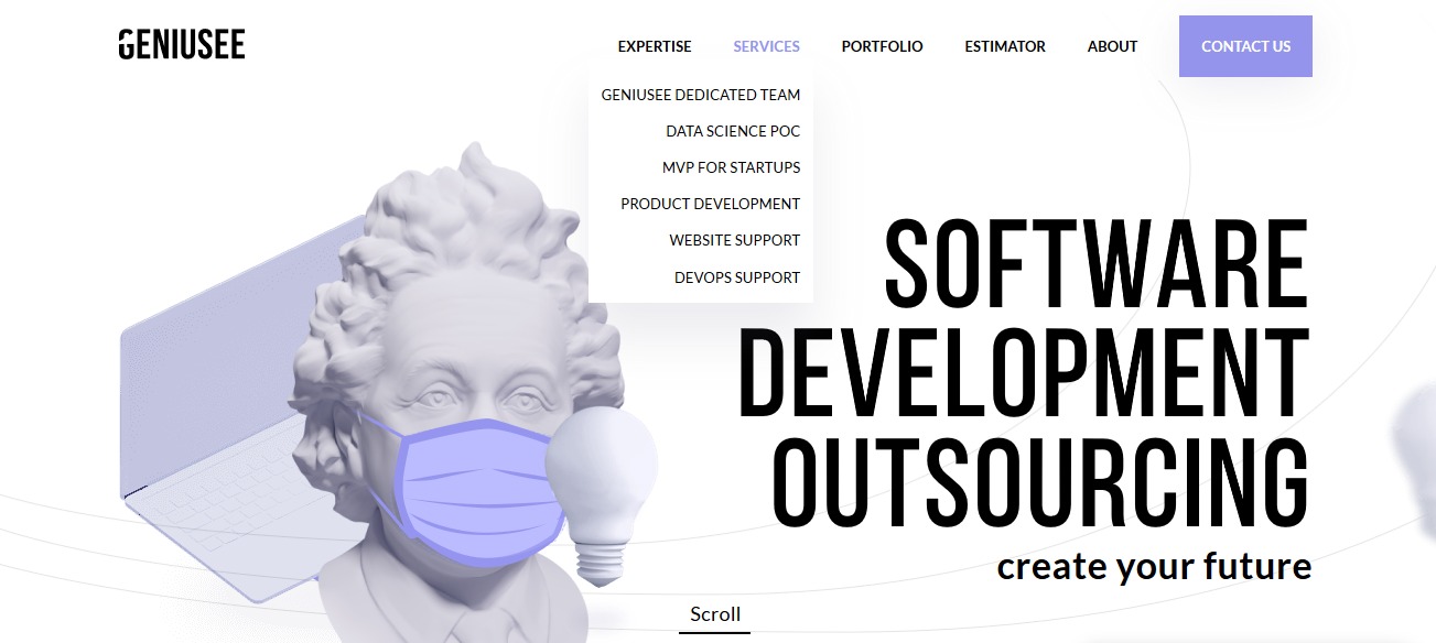
Use drop-down lists and menus only where it cannot be avoided. In other cases, try to show the users all their capabilities immediately. If some of the possible actions are hidden, the users may not even guess where they need to click to perform a certain action. And if these actions are targeted (“buy a product”, “place an order”), then they cannot be hidden at all in drop-down menus, on the contrary, they should be emphasized.
Have a look at an example of a drop-down menu that is aimed at being user-friendly — hovering over the sub-sections opens the menu sections, which is quite convenient, The "Contacts" button, on the contrary, is visible immediately, without additional hovering.
6. Be able to communicate with the user
The point is that the users must understand that their actions are currently being processed by the system. The process of sending a message should be accompanied by the display of the phrase "message is being sent", and the end of this process - "Message sent". If there is a failure in the system, the users must also be notified of this, as well as of the reasons for the error and what they can do in this situation. If the resource involves loading large amounts of information, then you need to place progress bars so that the user can monitor the state of the system.
7. Have different styles for buttons with different types of actions
In any interface, each button has its own purpose: go somewhere, open a menu, open a link in a new window, download, etc. Don’t confuse users by following these rules:
Clickable and non-clickable elements must be different. You can highlight them with color, font, and size. The users should immediately see which buttons they can press and go somewhere, and which are provided just for information.
Use color or style to highlight the section of the menu in which the user is currently located.
8. Be attractive
Functionality and convenience are good, but there is also an elementary “beautiful/not beautiful” notion. Any user will find it much more pleasant to deal with the interface, which, among other things, also pleases the eye.
But don't forget that beautiful design is subjective. You won't be able to make it equally beautiful for everyone, no matter how hard you try. Anyone will agree that when developing a resource for high school students and a resource for accountants, you will need to make different design decisions. Therefore, first of all, focus on your target audience and their needs. Discover the foundations of excellent UI/UX design and how these principles drive the creation of user-friendly interfaces.
9. Provide the ability to personalize
Personalizing user interfaces can lead to higher user satisfaction as it caters to individual preferences. Personalization is the ability to customize something “for yourself”. Most often, this function can be found in programs, services and applications. The user can change, for example, the font color, icon style, background image, and the size of the text blocks as they prefer to (choosing from the proposed options, of course).
In Trello, for instance, you can change the layout to a different color or image.

10. Be loyal to user errors
And yet, there will always be users who will not be able to understand something immediately while working with the interface. They will make erroneous actions, and then the interface is faced with the task of making sure that these errors can be quickly corrected. If the user accidentally deleted the information they needed, they should be given the opportunity to restore it. A user who wandered into the wrong page should be able to quickly return to the previous page or section by pressing the "back" button. To prevent erroneous actions, the interface should ask the user again whether they really want to do this. For example,
“When you close the current page, the download of the file will be interrupted. Are you sure you want to do this?" However, do not overdo it with such questions, otherwise it will become annoying.
11. Speak the user's language
All interface text and any designations should be created for the target audience of the resource. Everything is obvious here: if you are making an educational website for preschool children, then the text of the interface should be written in “children's” language. If you have a program for advanced webmasters, then you can safely use specific terms without explanation - the target audience already knows them. And if this is a service for beginners, then the language should be as simple as possible.
12. Provide the optimal number of choices
The more options you offer the user, the less likely they are to take any of them at all. If there are really a lot of options, and you cannot reduce them (for example, a product catalog), then use the recommendation function. For example, you offer ten product options on one page, but select one or two of them in the “We recommend” category. The client will pay attention to these products, which may make his choice easier.
13. Giving soft prompts
Tooltips are very good. They help the user to understand fully what they could not figure out themselves. The main question remains how to make these prompts effective and stress-free. Remember the paperclip from earlier versions of Microsoft Word? The company turned this feature off precisely because it caused a lot of negative emotions from users and was criticized.
To keep users loyal to the tips, stick to these points:
Do not write too much text in them.
Do not connect hints to each button, but limit yourself only to those where the user may really have difficulties.
Enable the user to close the hint or completely disable the hint function.
14. Have short registration forms
Getting the user to register is an important and one of the most difficult tasks of the interface. Usually, people try to avoid registering on sites that they are not going to visit regularly, or that they are not yet sure about. And often they even refuse to buy in an online store, if this requires mandatory registration, and go on to look for their goods on other sites. So that users do not feel hostility towards the registration process, you need to make it as fast and easy as possible. Do not use long registration forms where you need to indicate your entire biography. Limit yourself to the most essential lines.
15. Have simple principles for filling in the fields
Almost every site offers users something to fill out on it. In addition to registering on the site, this can be ordering goods, entering your contact information or filling in a survey form. If you make the form too complicated or stressful, no one will fill it out. Several important tips follow from this:
1. When filling in different fields (“city”, “street”, “date of birth”), it would be good to give hints to the user using a dropdown menu so that they do not need to enter all this manually, but simply select the desired option from the list.
2. If the user still needs to enter their data manually, then use the line-by-line system to check that the form is filled out correctly. No one will like it if the system, after each filling error, will reset all the lines filled in earlier.
3. Field names are best placed above the input lines. It has to do with human visual perception. It is easier for a person to perceive information from top to bottom or from bottom to top than from left to right or vice versa.
4. Minimize the chances of filling out the form incorrectly.
Imagine the situation. You start typing your phone number in the field. After the first filling, the system tells you: “The phone number must be entered in 10-digit format”. You enter again, and the system gives you: "The phone number should not contain hyphens." And then you will already start to get nervous and mentally curse this site (or maybe not mentally). The ideal input form is when the user can write anything into it, and the system will not tell him “wrong”. Of course, data processing will be somewhat difficult, since you will have to process some of the requests manually. But your main goal is to take the order, not weed out impatient customers.
16. Provide convenient control options
If on sites we mainly use a mouse (except for the standard functions "copy/paste", etc.), then in programs and applications it is often convenient to control from the keyboard. Let users choose the kind of control they like best and show which function corresponds to which key combination.
How to create a user interface for commercial products
We have already partially talked about what the interface should be so that users do not say goodbye to the product immediately after they meet. Intuitiveness, predictable behavior, simplicity, responsiveness, and error protection affect the user experience, but there are other aspects that are also important. In this section, we want to share our own experience on how to design a user-friendly interface for commercial projects and some user interface techniques that you can use to create a great product.
1. Make the UI communicate with users
There are apps and sites that tell a story through typography, animation, and other elements. The user should understand without further ado what he needs to do and which section to go to to see information about delivery or a catalog of goods.
Visual storytelling is a powerful technique that can help engage your audience in using a product. We must try to make the interface as simple, logical and “speaking” as possible. This does not mean that you need to add as many tips and other interactive tools as possible.
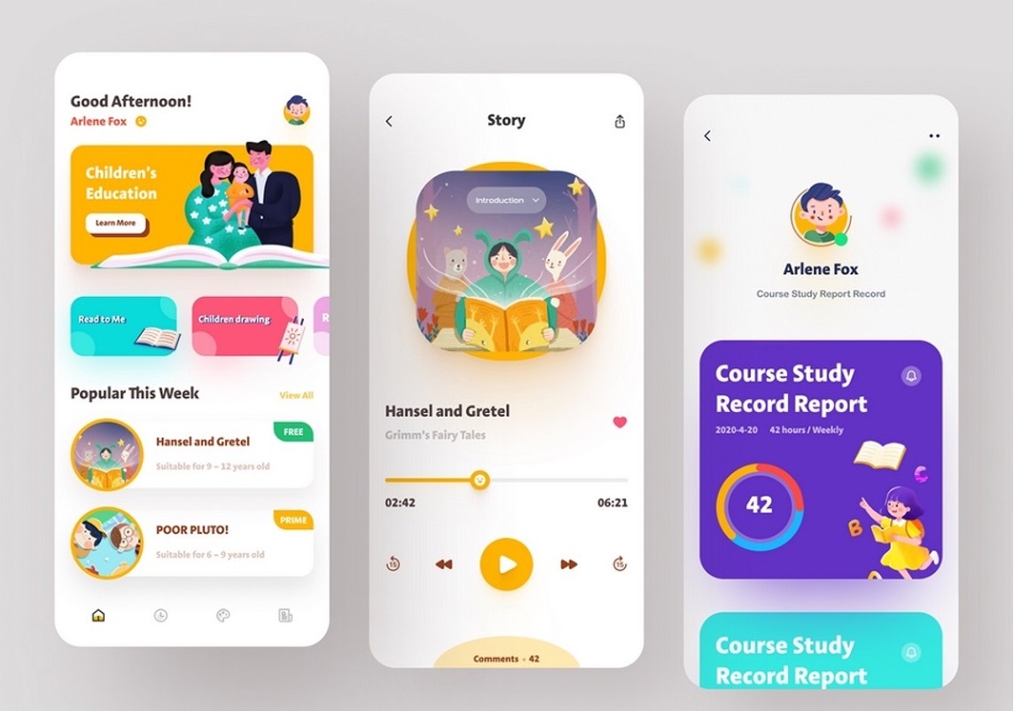
If the user arrives at the end point of the route without reading the knowledge library, then the designer and other team members have coped with their task. The less time it takes to learn, the better.
Communication with the audience can manifest itself in different ways, but you should not put too much pressure on people. Give them free rein and analyze how they use the UI.
2. Take care of attractiveness
Attractive user interface design is essential, as it directly influences first impressions and user engagement. The concept of beauty is very relative, but with attractiveness everything is simple. If the interface is user-friendly, the product will be pleasant to use and can have a good conversion rate.
Problem-solving combined with convenience and positive emotions is the foundation on which all successful projects are based. If you offer users two of the same tools that differ only in appearance, they will choose an option with a more attractive interface.
It is important not to confuse attractiveness with beauty and aesthetics. These concepts are very different, they have different meanings. As we have already mentioned above, making the UI beautiful for everyone will not work, because people have different ideas about it.
It is not necessary to spend too much time on the look. Analyze popular niche products and select the solutions that best fit the definition of “attractive”. Think about what exactly influences positive audience emotions and how to achieve the same effect.
3. Consider personalization
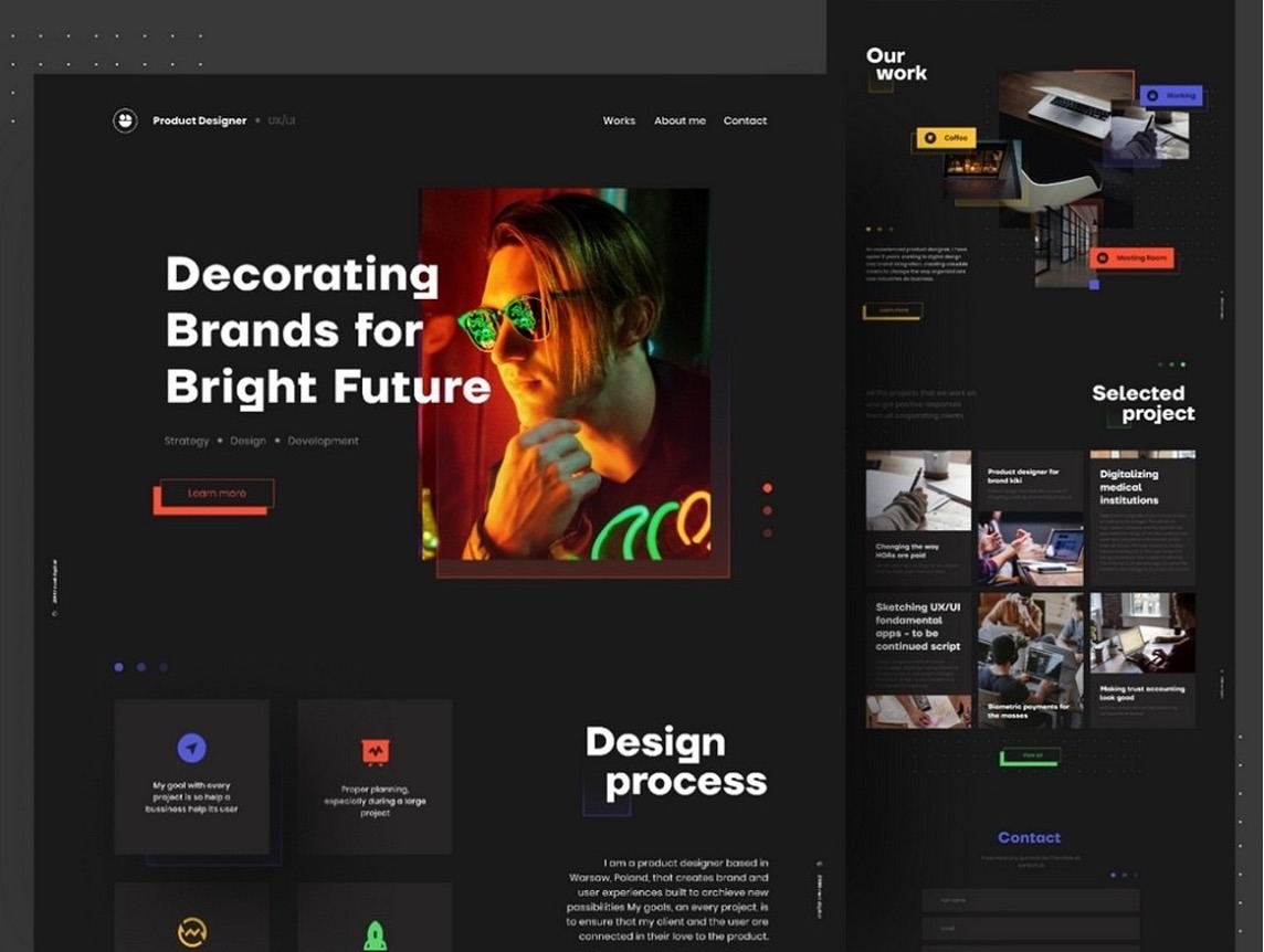
Users love it when products are tailored to their needs. It's like new sneakers that fit perfectly and are great for running. After the first use, you get the feeling that they were always at hand and helped to solve everyday tasks.
Personalization shows people that they can adapt the product for themselves and not play by someone else's rules. For example, in apps you can change the theme, rearrange items on the home screen, and disable unnecessary features.
It's important to understand that personalization should be moderate. Freedom of choice is good, but problem-solving always comes first. If users disable important features without which they cannot complete the intended action, personalization will not be beneficial.
To solve this problem, it will also be useful to analyze the solutions of competitors. See if their products have the ability to change the default behavior of tools and think about what can be improved to provide the perfect user experience.
4. Explain actions
If, at the moment of acquaintance with the product, people have a feeling that they do not understand what is happening, this is an alarming signal. We must try to avoid such situations. For commercial products, they can be fatal.
System status messages are a standard mechanism that is used in both sites and applications. After submitting the form, you should see a notification about successful data submission or information describing the error.
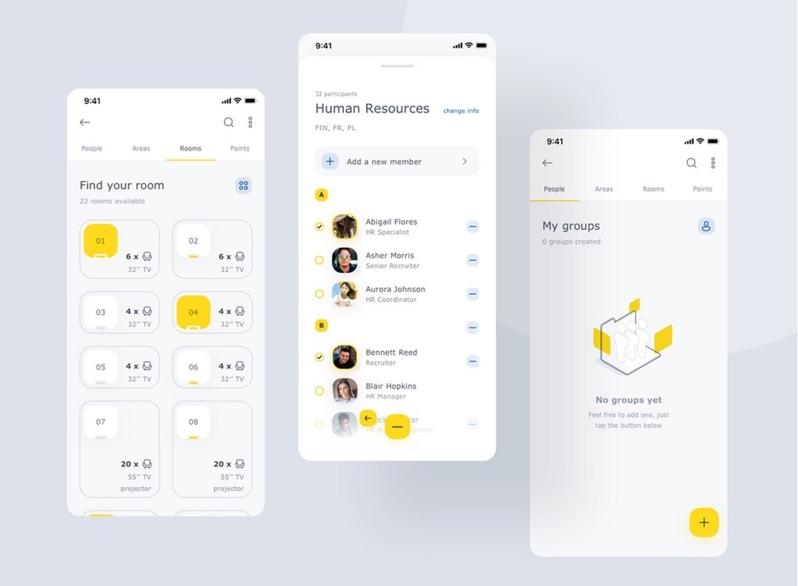
After performing any actions, users through visual means should understand that the operation was completed successfully or that the actions must be repeated again. You can't show toast notifications too often, so you can use subtle animation for some tasks.
Soft prompts are ideal because they don't apply pressure, but still get the job done. Only add tooltips to items that might raise questions.
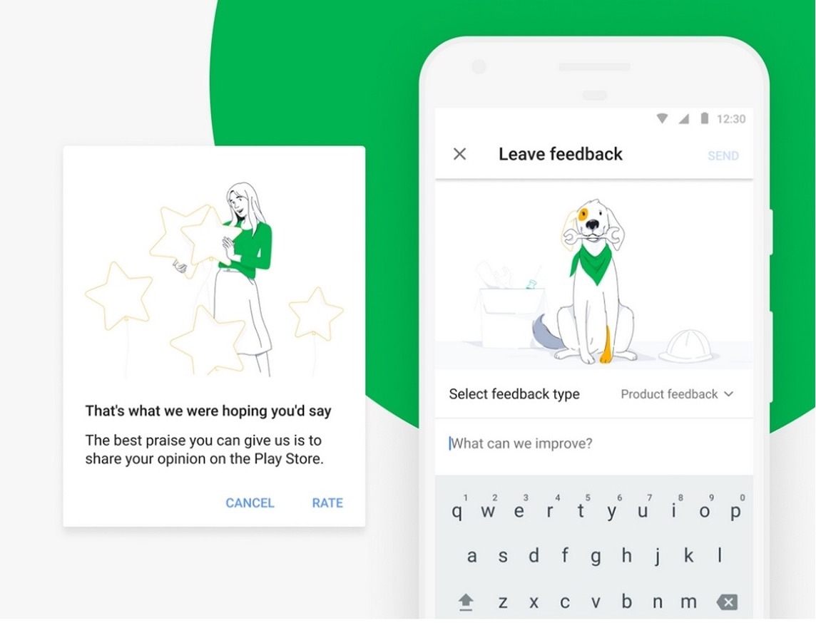
5. Collect feedback
When users encounter problems using a product, they can either say goodbye to it forever, or give it a second chance and tell developers exactly what they didn't like. It all depends on how well the work with feedback is organized.
Gathering feedback is an important part of any product. The same rules apply here as when working with prompts. It is necessary to invite people as unobtrusively as possible to describe their emotions from the use and ask them to tell what, in their opinion, can be improved.
In the process of developing an interface, team members often turn to the representatives of the target audience for help in order to jointly find the perfect solution, but this is not enough. When a product appears in the public domain, the number of testers increases several times. Some of them may find errors that were not noticed at the stage of creating the UI.
The easiest way to organize feedback collection is a form with several fields and a button for submitting data. You can make it open by clicking on the icon at the top of the screen. Don't emphasize it too much — do just enough so that users can know they can always speak up. And don’t forget about usability testing. It helps determine if users can navigate the interface efficiently without confusion.
6. Think about users
Any site or application is always created for people and their needs should come first. It is very easy to distinguish a quality product from an unfinished one. A few minutes of checking will be enough to find critical errors and decide for yourself that it is inconvenient to use the interface.
Newbie designers are often told what to think about the audience, but not what exactly to do. The secret to creating a successful commercial product lies in a user-friendly UI that helps you quickly solve problems.
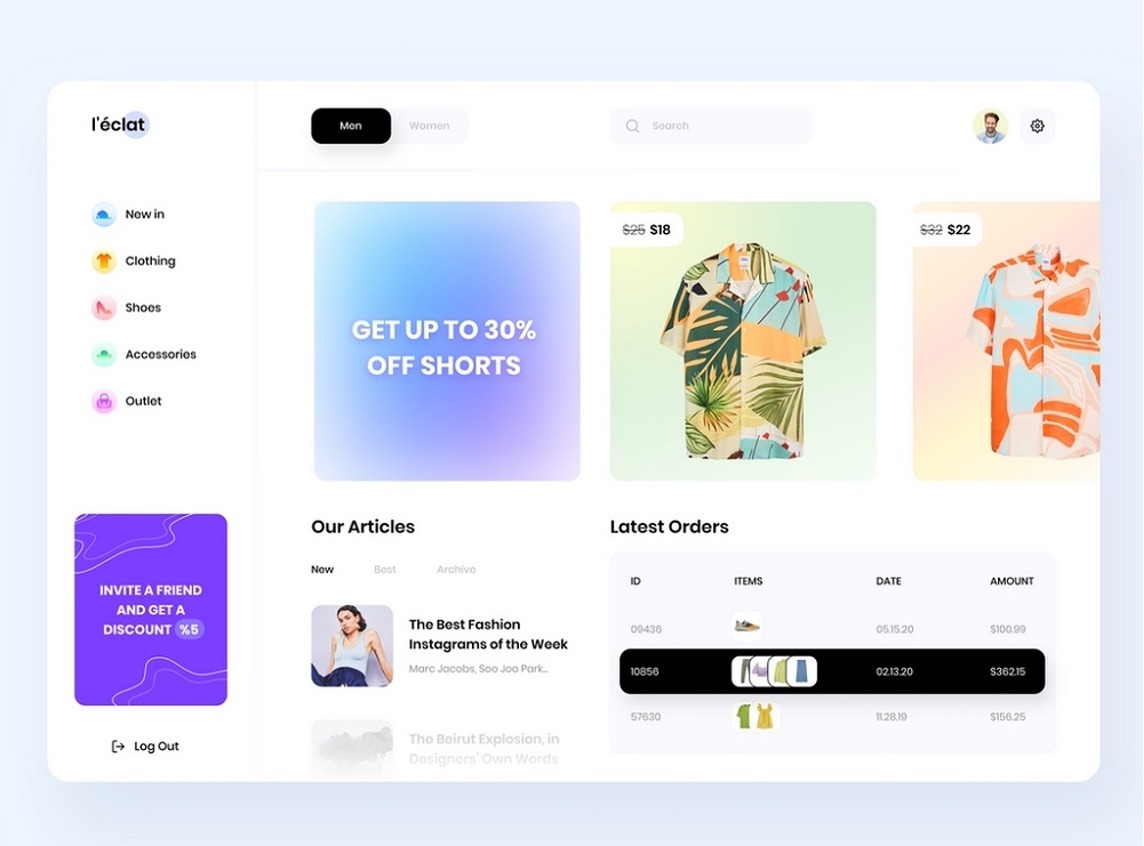
Imagine that the designer was tasked with designing a standard online store with a catalog, shopping cart and order form. All efforts should be directed towards the development of pages that are directly related to the purchase, and other tasks should fade into the background.
Many designers concentrate on typography, animation and other secondary things and forget that the user just needs a convenient catalog, and that it should take no more than a couple of minutes to place an order.
How to test the interface for usability?
And, as we promised at the beginning of the article, now we are going to tell you a little about testing the interface. Why is this so important?
During the development of the interface, errors could creep into it and that will affect the operation of the entire program or resource.
You can never immediately nail the optimal interface design, the one that will be perfectly perceived by most users.
The interface can be displayed normally on one device (or in a browser), and be completely incompatible with another.
Testing can solve all these problems. How can it be done?
1. By hand
Such testing will require a lot of time and physical resources, since the whole process will be carried out by a person. But this is also the plus of manual testing. To implement it, you will need a tester who will check step by step how the system reacts to a particular user action. The most convenient way to do this is to create a special table into which all the data will be entered.
2. In an automated way
This method of testing is carried out with the help of special software, which, as it were, imitates the actions of a living person during manual testing. This testing does not require human intervention, so the speed of the test increases and the cost of money decreases. There is one big “but” here. Automated testing cannot give 100% results, since it is carried out only on formal grounds (those that are hammered into the program) and does not provide an opportunity to find usability defects that can only be perceived by a human (for example, the color scheme of the interface).
3. Using focus groups
Don’t ignore this testing method in terms of price-performance ratio. It is carried out as follows:
Several focus groups are recruited, consisting of your target users. You can divide groups according to different criteria: registered / unregistered, regular/rare users, as well as according to different demographic indicators (which fit into your target audience).
Each group is given tasks to perform certain actions on your website/service/program. You have to tell the subjects what they should do but don't say how they should do that. This is the essence of testing - to see what actions users will take to achieve their goals.
After all this, you analyze exactly how the subjects performed their tasks — where they clicked, which links they followed, whether they quickly found what they wanted, etc.
Conclusion
The goal of user-friendly interfaces should be to enhance user satisfaction across all interactions.
When designing an interface, remember that too much attention to one characteristic can significantly harm another. By removing some elements in an effort to achieve minimalism, you can create problems with the understanding of the user interface. By embodying the characteristic of attractive design, you run the risk of overdoing it and making the interface too heavy to load quickly.
Therefore, the most important in this whole story is to maintain the perfect balance of all interface properties, and then it will be truly user-friendly.
Implementing abovementioned techniques will refine your user interface design, making it more intuitive and user-friendly. If you need professional assistance on digital product designs, get in touch with our experts to discuss your project.


