Conversion is a strange subject. It comes and goes. To ensure that the conversion of the application is always high, use the 20 methods from our article.
To increase the app conversion rate, you must work directly with the product.

Here are 5 universal recommendations:
- 1. Strive for maximum personalizationThe application should be a priori convenient. It is desirable – also as personalized as possible. Even free. Examine your users and provide them with the content of interest.
Collections, recommendations, discounts on selected products or services that the user regularly uses. There is no single solution, the choice depends on the type of business. - 2. Provide users with convenient navigationSimplify your navigation and reduce the number of possible steps. Everywhere. First of all, it concerns registration, authorization, and payment. The fewer actions the application requires from the user, the higher the chance that the application will not be deleted on the first day.
Get rid of distracting elements. Let people get what they came for in the app. Help them with this: arrange the menu items and product categories sequentially, add links to go to sections in the texts within the application, etc. - 3. Make an interesting call to action
 Call-to-action is able to significantly increase the conversion. But if the form is done incorrectly, it may not be used at all. There is no universal recommendation.
Experts advise buttons (not just links). Everything else must be tested by trial and error with a specific audience. A / B testing will help to do this without loss. - 4. Use notifications to remind yourselfAccording to statistics, 52% of people agree to receive push notifications. Therefore, do not refuse them. Remind people of the app, products left in the cart, or talk about updates. The result will be notifications stimulate downloads in more than 88% of cases.
- 5. Work with deep linksDeep links – links that set the internal page of a site or application like the one that the user clicks on. The usual deep links hold people back.
Deferred deep links attract new users. Links of this type “understand” that the software has not yet been installed on the smartphone, so they send a person to the store page. When the software is downloaded, it will open the page where the link led. To do this, the user will not need to perform any action.
If you use deep links rationally, it will become quite difficult to lose a user on the way to the application. People come – conversion is growing.
Ways to increase conversion for different business models:
Depending on the business model of the application, they use different ways of working with content and conversion rates.
For free applications this

- 6, Quality contentIdeally, the texts, videos, and images of the free application should not differ from the content of more monetized brothers. This is logical: do not save on quality, otherwise people will not linger.
In addition, high-quality content does not require large investments and expensive iron. A good specialist can provide a basic level of decent graphics, texts, and code. Yes, it is not free. But not so expensive as to neglect the reputation. - 7. Caring for people (free)You’ll have to at least think a little about users. To increase the conversion, you need to provide something more than a minimally comfortable level of existence in the application. Do not overwhelm people with advertising, introduce useful features, optimize product performance as if people are paying you. And this will happen, only due to conversion.For shareware
- 8. Trial periodsProviding trial periods is useful for conversion. The optimal period is 7-14 days. If the functionality of the application is pleasant to the user, then he will pay for further use.
If a person decides to refuse, send him a survey form and specify what went wrong. Even if the user cannot be returned, material for work will appear. At a minimum, with a refinement of the target group and targeting it. - 9. The optimal ratio of paid and freeIf there are too many free features, you won’t lose the conversion. But miss out on some of the potential revenue. But if almost all the tools turn out to be paid, you won’t get either one or the other.
Therefore, it is necessary to approach resource allocation within the application rationally, especially if it is a free-to-play game. A paid resource should not turn a user into an ultra-strong creature and upset the in-game balance.For paid - 10. Careful work with advertisingMonetizing already paid applications is not desirable, but I really want to (understand). Therefore, advertising must be entered carefully. This can be a native text or banner, sponsorship products for a fee, or a beautiful and unobtrusive rich media that pops up at the end of the session (and not every time).
If there is too much advertising in a paid application, people will start to leave it. Therefore, to maintain the conversion, it is recommended to be as selective and careful as possible. - 11. User supportTo increase the conversion in the application, you can optimize user support. Let it be around the clock and instant. Select the best specialists for paid products so that the user doesn’t feel indifference and remains with you.CONVERSION IN INSTALLATIONNo less important. Work with it takes place outside the application: in the App Store and Google Play, as well as in the graphic editor of your designer. It is worth taking these points seriously. After all, if there are no downloads, then you should not wait for purchases inside.Here are 5 points that will increase the sales conversion rate, regardless of the product’s business model:
- 12. Use keywords even in the titleThe limit of characters in the App Store is 30, in Google Play – 50. In addition to the name, it is desirable to indicate any keywords in the title. They will make your product visible in the search because no one will hammer in a brand (especially unknown to anyone).
- 13. And in the subtitle, tooSubheading keywords affect search less, but nevertheless it is better to add them too. Suitable: “online”, “buy”, “inexpensive”, etc. Words can be any, it depends on the type of business. The main thing is to organically enter keywords into the proposal so that the subtitle does not get out of the general style.
- 14. Make a description correctlyThe description field is required. It’s best to indicate everything in it: functions (basic), application benefits, special offers, contacts (if required). A limit of 4000 characters should be enough.
Please note that on Google Play the description text affects the search. Therefore, it is also recommended to use keywords. It is advisable not to repeat them with the ones already used, or at least to change by cases/decline.
In the App Store, the description is not affected by search results. Apple lovers can exhale 🙂 - 15. Consider the first three lines of textThis is a preview that is revealed in full description. Not indexed, but attracts attention. In fact, it is the first three lines of the text from paragraph 14, so you need to write a description keeping this fact in mind.
The limit is 170 characters. You can edit.
Only App Store is suitable. There is no promo text on Google Play. - 16. Always notify people of updatesThe “What’s New” field is required. Otherwise, the conversion to installation will drop to zero, and the application will shut down. Joke. But alerts are really important.
In addition to the fact that the announcements attract attention, they are a direct connection with the audience. People react positively when they see reports on updates and bug fixes, this shows that they are working on the product.GRAPHIC SUPPORTIt affects the conversion no less than the text, Therefore - 17. Make an attractive iconThe icon is displayed everywhere, it should attract attention and reflect the essence of the application. Here are some suggestions that can help with conversion:
- draw a logo on the icon. It becomes familiar, and the company will be remembered. If the business is already known (at least in its field), it will be easier for people to find your application
- high contrast. A bright icon will attract more attention than an image with low contrast and calm colors
- the essence of the application. The image of the main function of the product will help people to identify their requests with the product easier. For example, a book is often placed on the reader’s icon, a smartphone’s camera on photo editors, etc.
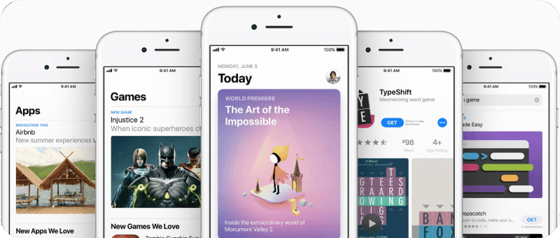
- 18. Add screenshots to the descriptionIt is recommended to attach screenshots of the application to the descriptions in the store. This will help users understand what is waiting for them “inside”, how this product differs from others, whether it has any specific elements, etc.
Google Play allows you to upload 8 screenshots, the App Store – 10. In both cases, the images can be both vertical and horizontal. Keep in mind: one horizontal screenshot is three vertical in terms of the occupied area. - 19, Add a promotional video to the descriptionIt’s also recommended that you attach a video to the descriptions. This may be a demonstration of the basic functions of the product or its design. Content will depend on the application, but the characteristics will depend on the store.App Store:
- if the video is horizontal, the screenshots in it will be horizontal by default, and vice versadifferent videos are allowed for different localesYou must create separate videos for the iPhone X and iPadautoplayplays without soundlimit – 3 clips
- The original video must be uploaded to YouTubeno autoplayfull-screen mode is only available for horizontal rollers. It’s better to take this opportunity, as full-screen videos provide the best conversion
- 20. Work with a ratingIt does not have to be perfect (please do not buy reviews). On the contrary, estimates can be different. Within reason: applications with a rating of 3 and below are almost not converted. Therefore, you need to reach at least 4 stars.
To increase the conversion using the rating, you can create a request within the application. For example, a pop-up (window) in which the team asks the user to rate and write a comment. The main thing is that this form does not prevent a person from using the product.
CONCLUSION
Each of these methods can boost application conversion. The main thing is to do everything right and approach wisely any changes. If in doubt whether to try something new – use the A / B test. The result will be visual, and the risk is minimal.
Do not forget: the product is made by people and for people.
The user will feel this and will definitely come to you.


